Rebranding story: Risking to transform for #the_3rd_time after #more_than_6_years of operation in education with 7 centers all over the North. Has BeeSchool achieved the expected outcome?


Challenges
In this project, BeeSchool desires to find new and unique colors to alternate the monotonous and common image which has been built over the last 6 years. Thus, Tree Create is tasked to give a refresh to the logo, recreate the brand identity that evokes a close, professional and reliable experience while still maintaining the funny features that fit the age of the learners. The brand image should convey the spirit of “Enjoy Learning English” with emphasis on the enjoyable and joyful experience for each young learner at BeeSchool.


Creative solution from Tree
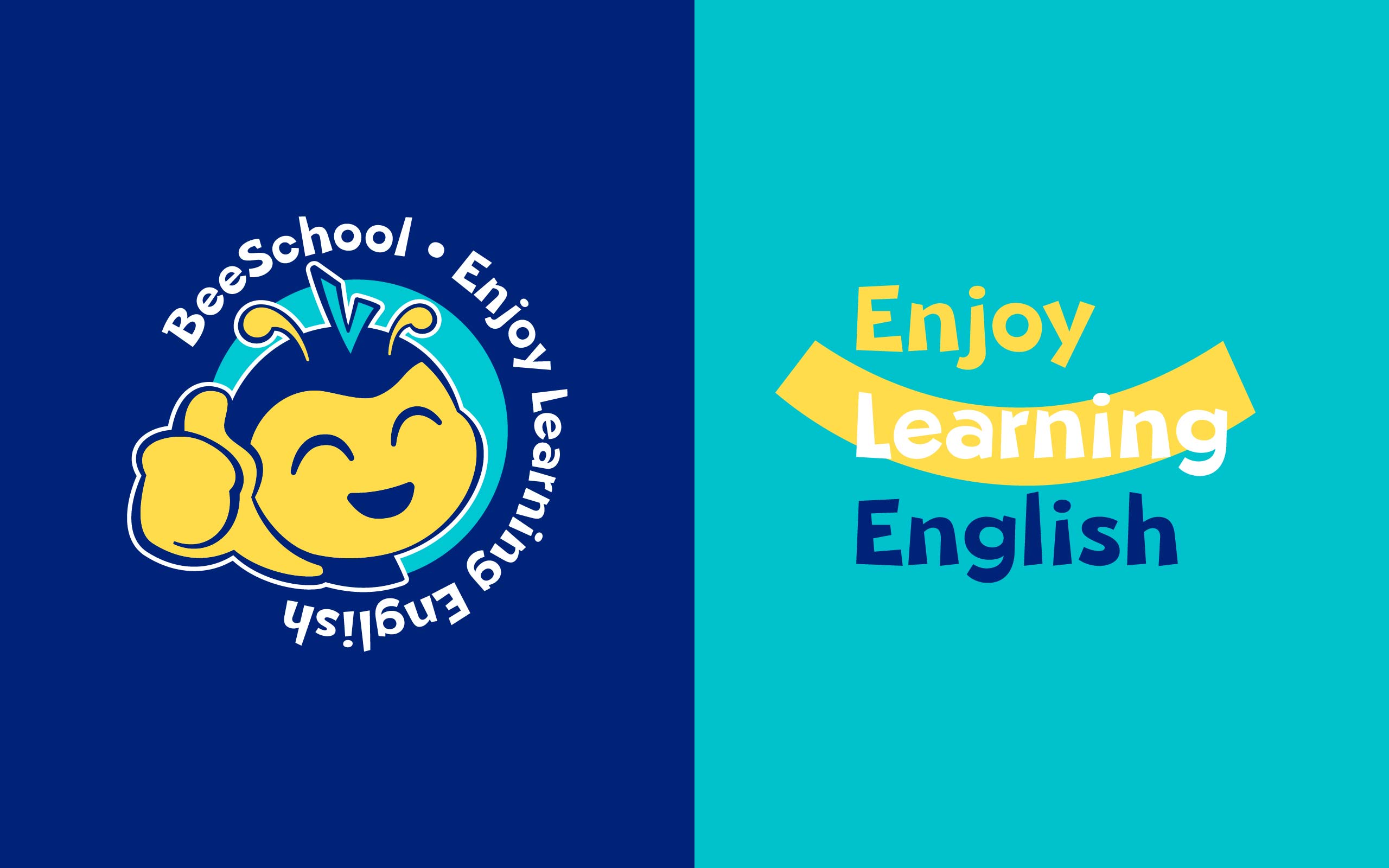
The image of the friendly Bee KaKa is continued to be developed with a constant smile on his face, representing the unique educational environment at BeeSchool: Play to Learn, Learn to Play, with the mission of bringing English to children in the most natural, comfortable and enjoyable way: Enjoy Learning English.The mascot shows the hard-working Bee KaKa, who has now been more mature, human-like, resembling the development of BeeSchool, while still retaining the inherent fun and closeness. Tree Creative has selected a logo that combines Mascot and Text to help increase customer experience and impart the brand’s message.
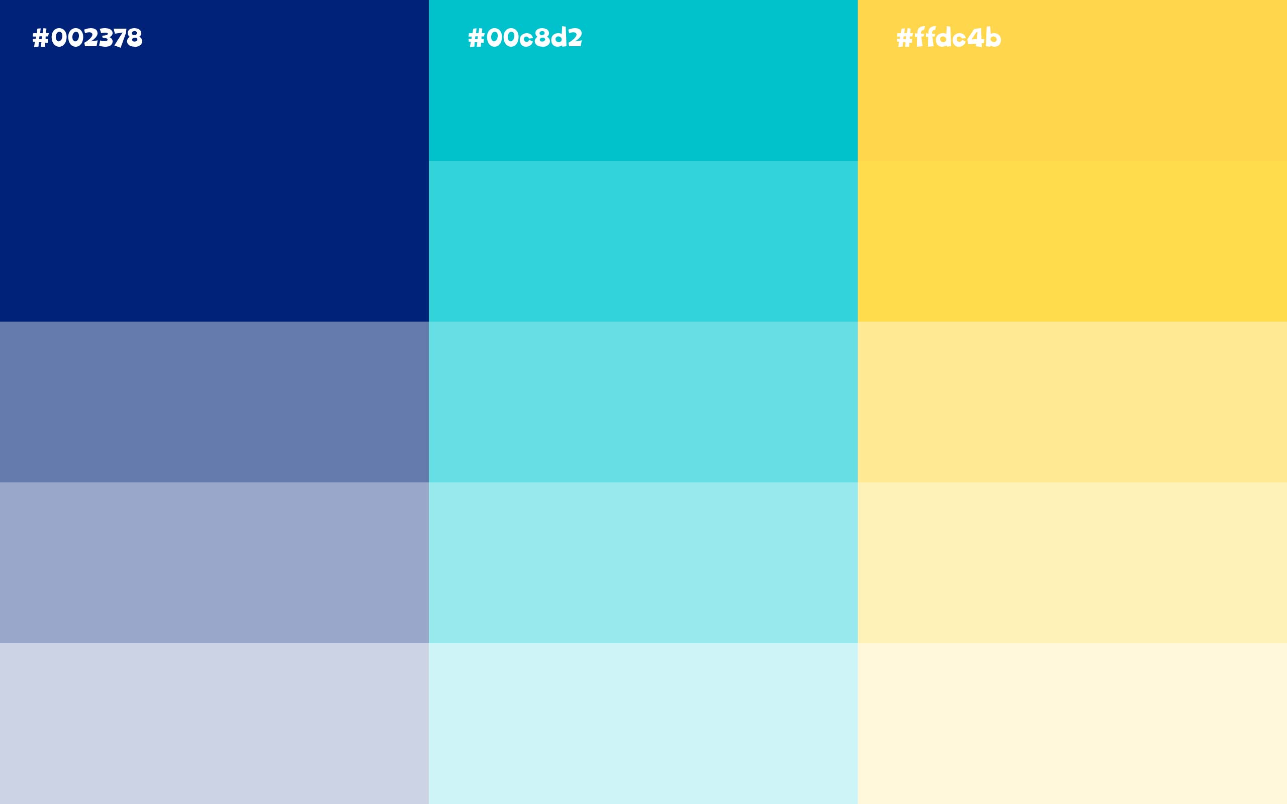
The 3 main colors selected are: dark blue, turquoise and yellow, representing the characteristics of the educational environment and people at BeeSchool. Dark blue represents wisdom, strength, firm will and professionalism for increasing trust and prestige. Turquoise creates a feeling of closeness, friendliness, peace and comfort. Yellow, the color of sunshine, the color of joy, brings warmth, optimism and prosperity.
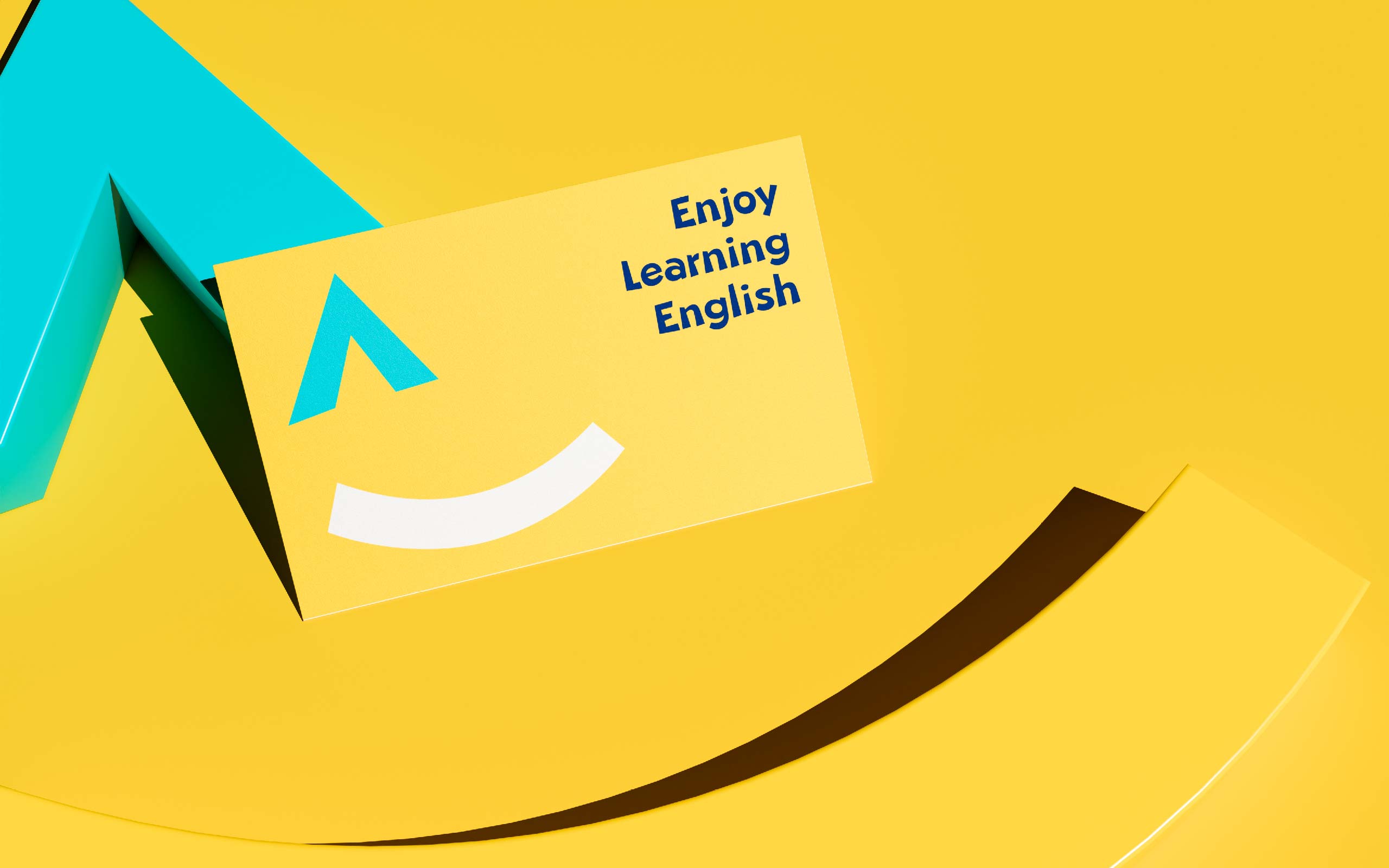
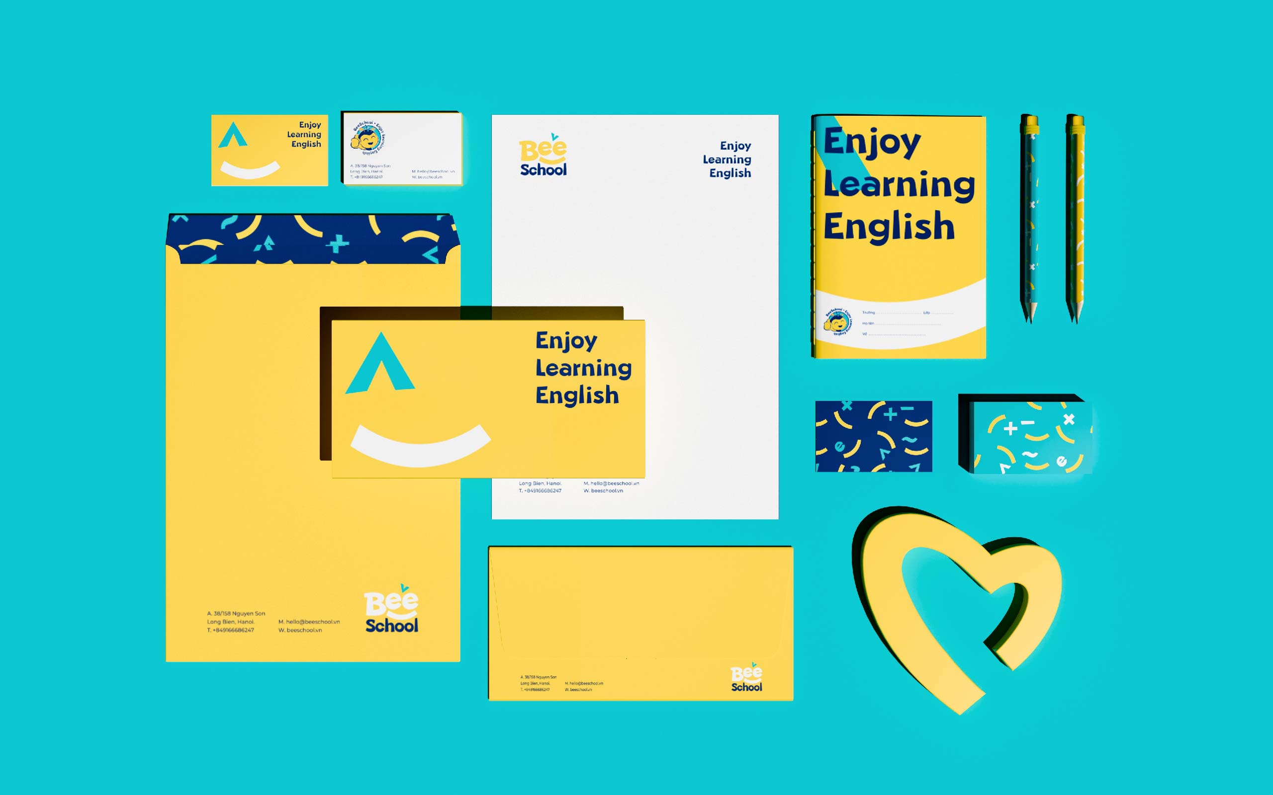
In addition, the identity pattern is developed based on logo block and brand image philosophy (Enjoy Learning English), with various shades of funny smiles, creating a sense of optimism and friendliness and bringing interesting experiences for young learners


Outcome for the cooperation between Tree x BeeSchool
BeeSchool has completely “transformed” its appearance, from logo, brand identity to learning space decor toward a consistent, professional brand image following a long-term strategy, increasing the “touchpoint” in each customer’s experience. Cooperating with Tree Creative, BeeSchool has succeeded for daring change to thrive. So, what do you think? Is the risk worth it?


