Interior
Butecco
AWAKENING BRAND IDENTITY FROM THE SMALLEST DETAILS
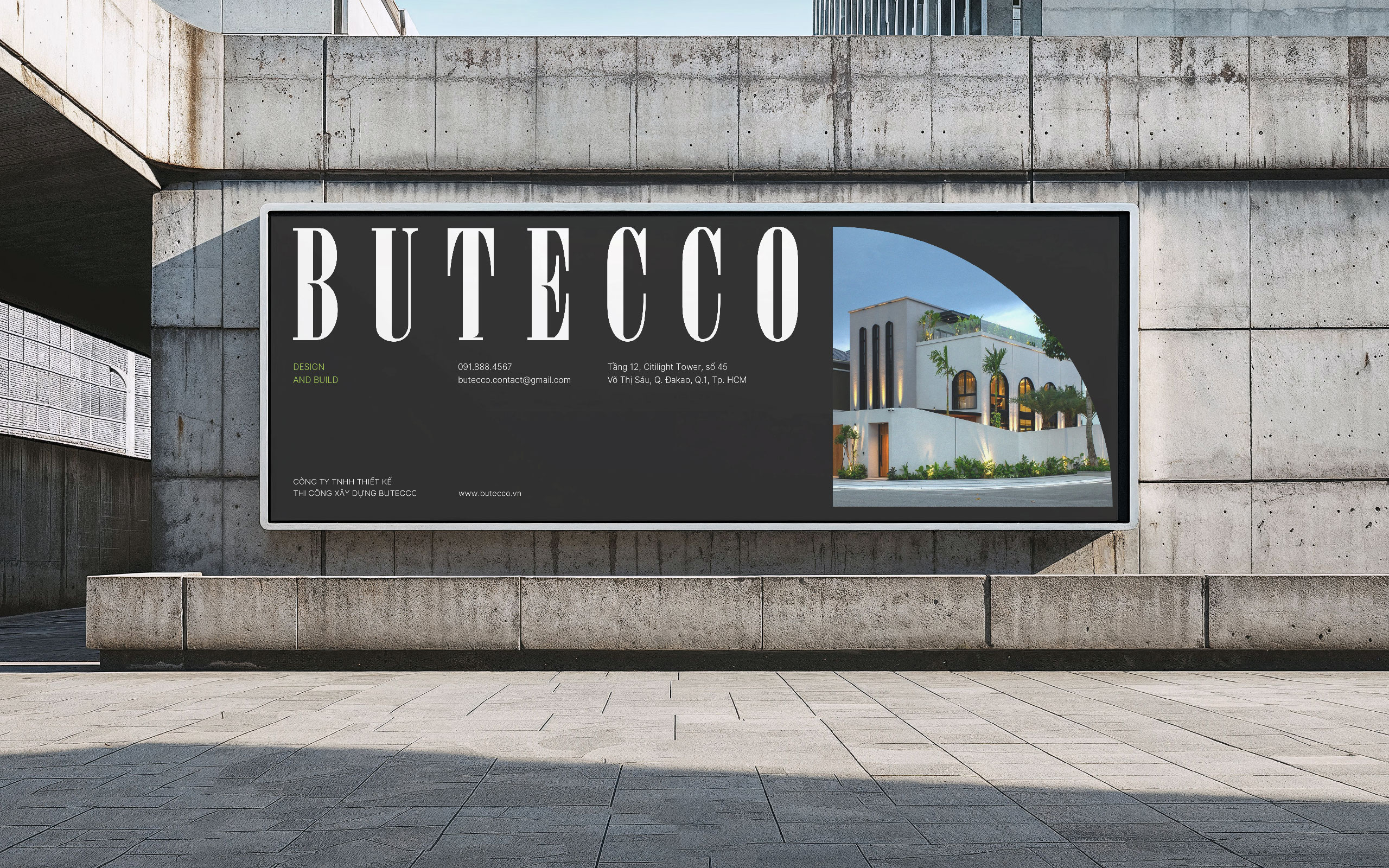
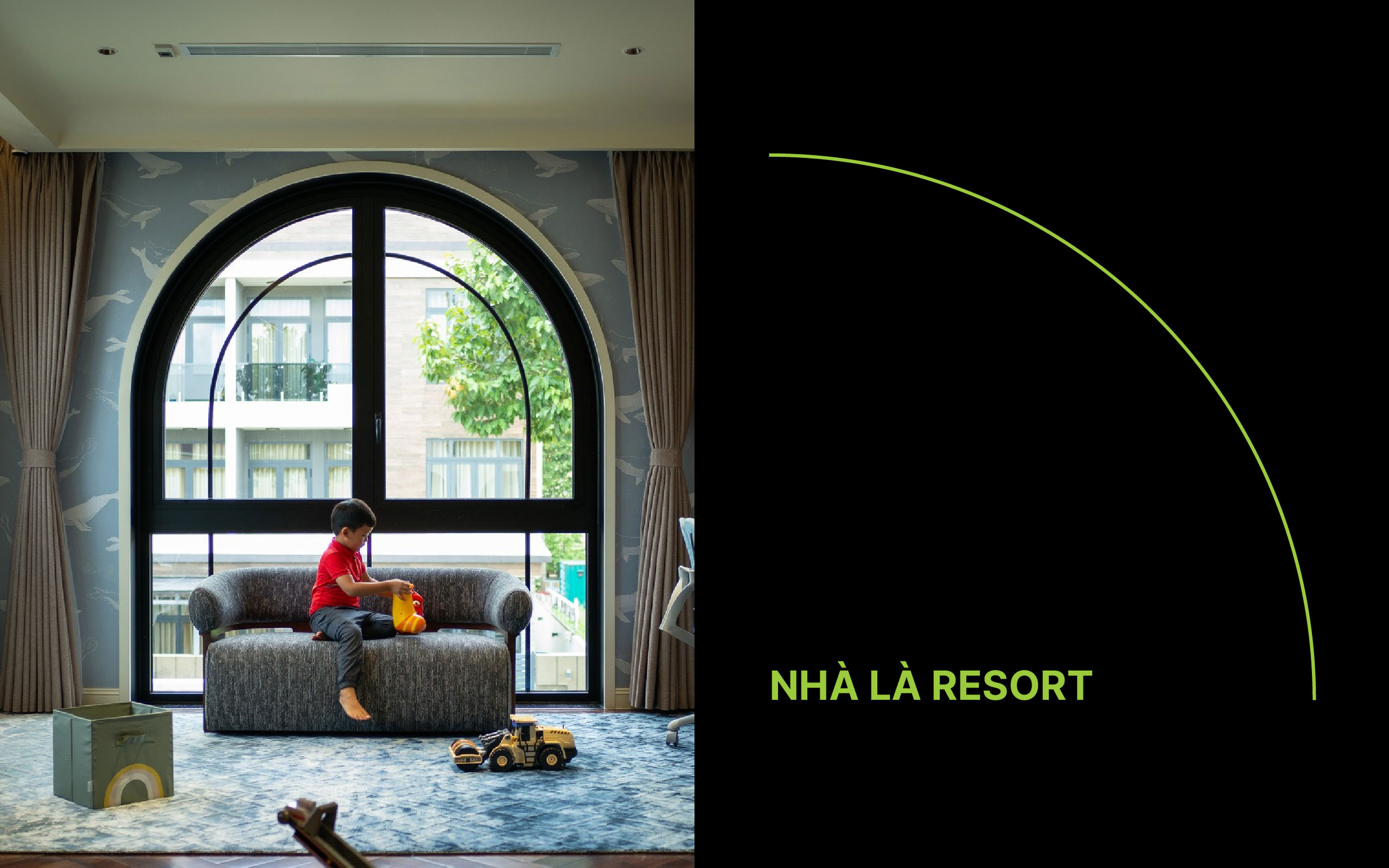
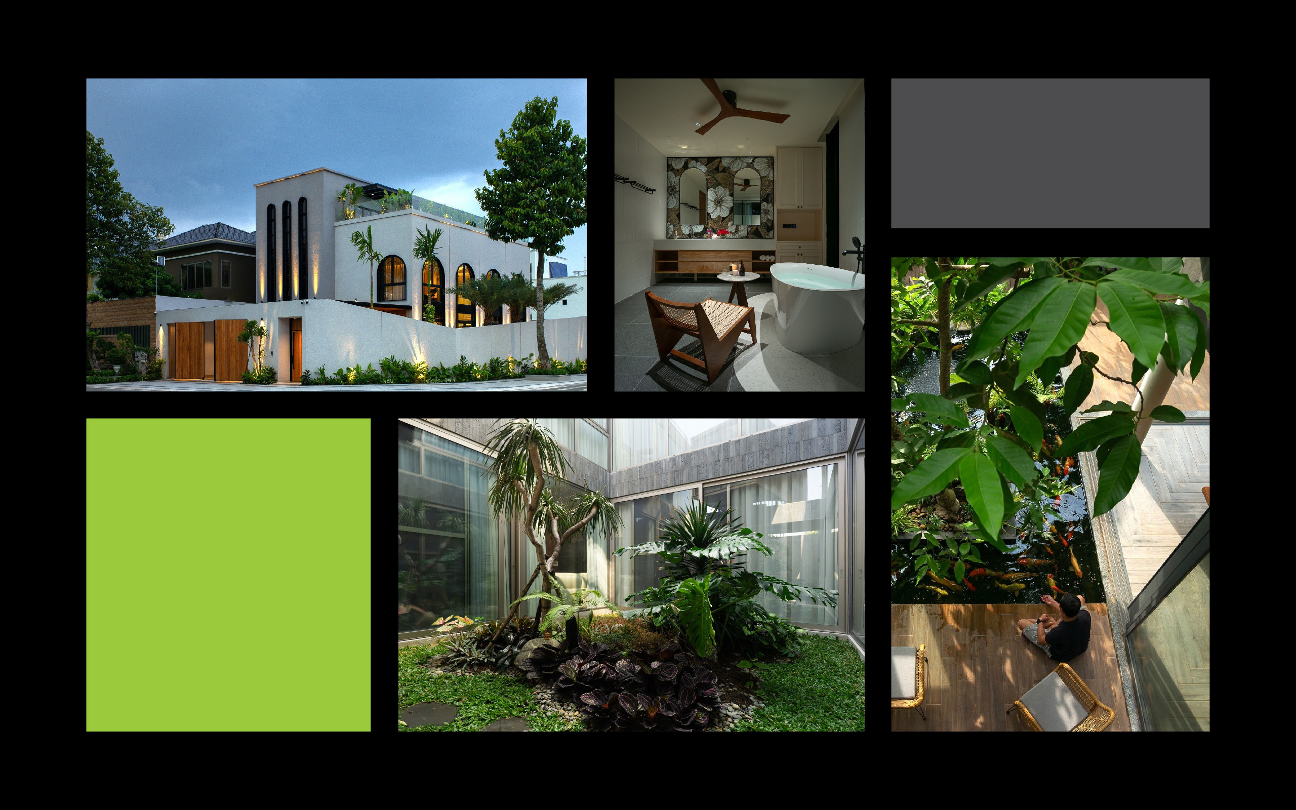
Founded in 2015, Butecco is a brand specializing in designing and constructing residential interiors, villas, luxury apartments, hotels, and restaurants… with a minimalist, refined style tailored to each client’s needs. Over the years, Butecco has left its mark through hundreds of real and practical design projects, earning trust thanks to its team of experienced architects and a professional workflow. Guided by the philosophy “Homes are Resort,” Butecco has spent the past decade bringing the essence of resort living into everyday homes, creating healing spaces that restore and nurture the body, mind, and spirit for every client.
With more than a decade in interior design and residential architecture, Butecco is not only a familiar name but also one of the most skilled and aesthetically discerning firms in the industry. However, on its journey toward sustainable growth and elevating brand experience, Butecco made a strategic decision: to collaborate with a professional creative design agency, Tree Creative. Refreshing its brand identity into one that is modern, professional, and worthy of an international presence.
REFINING THE TYPEFACE – EMBODYING METICULOUSNESS IN EVERY DETAIL
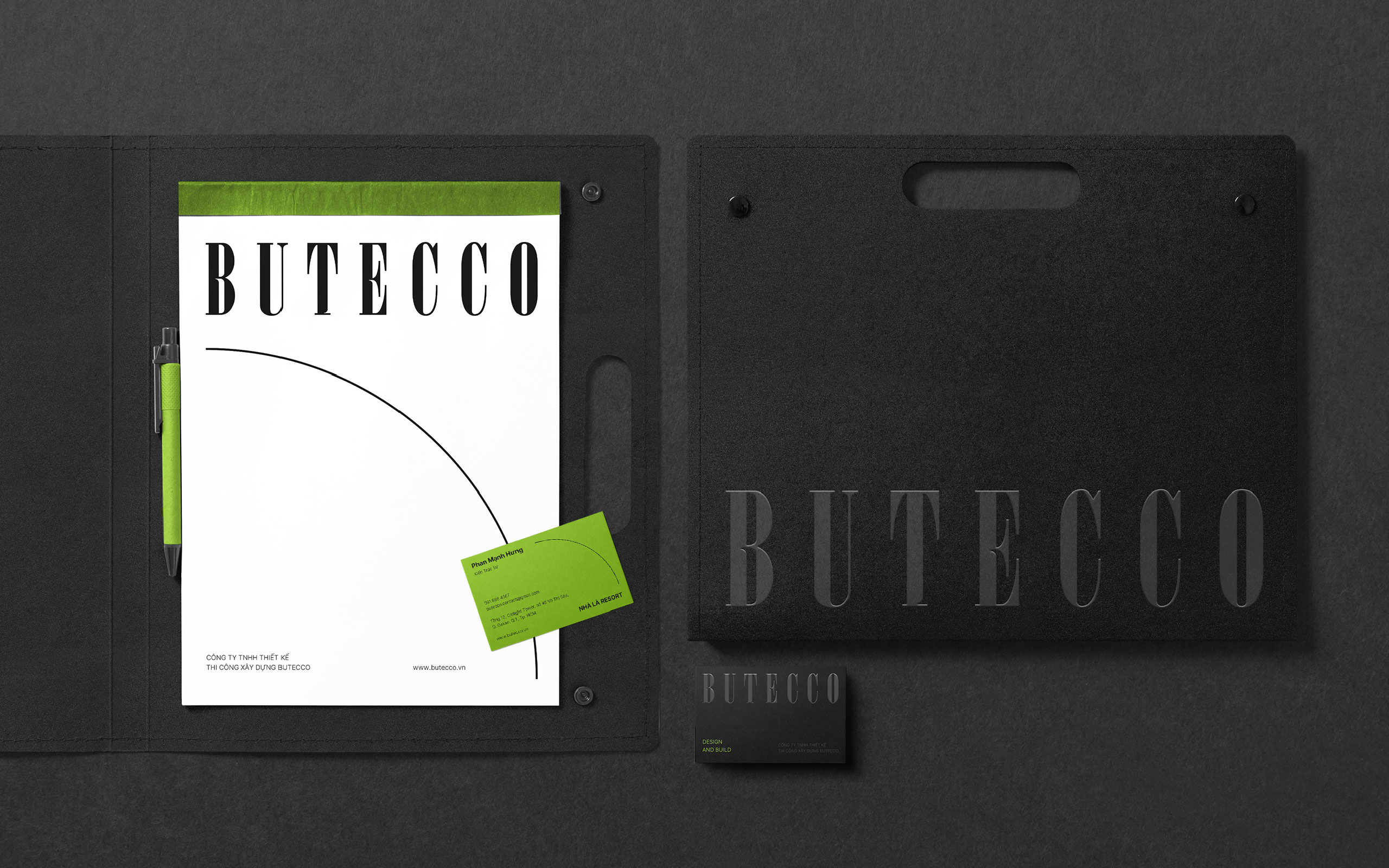
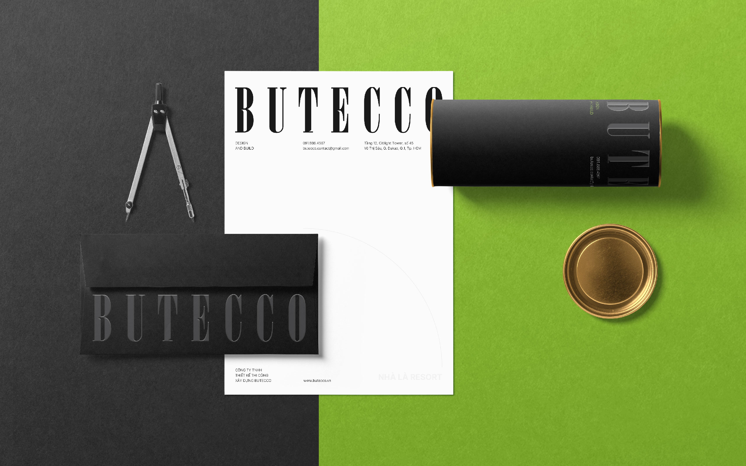
The rebranding process began with fine-tuning the logo’s typeface, transforming it from rigid lines into softer, subtly curved strokes. This change not only enhanced its aesthetics but also conveyed craftsmanship and the attentive care that defines how Butecco approaches each living space.
The gentle yet decisive curves bring a sense of both modernity and warmth, reflecting a refined aesthetic taste and serious craftsmanship. Each letter feels like a cross-section of the design process, meticulous, deliberate, and infused with passion.
GREEN & BLACK: A VISUAL IDENTITY OF ELEGANCE AND SUSTAINABILITY
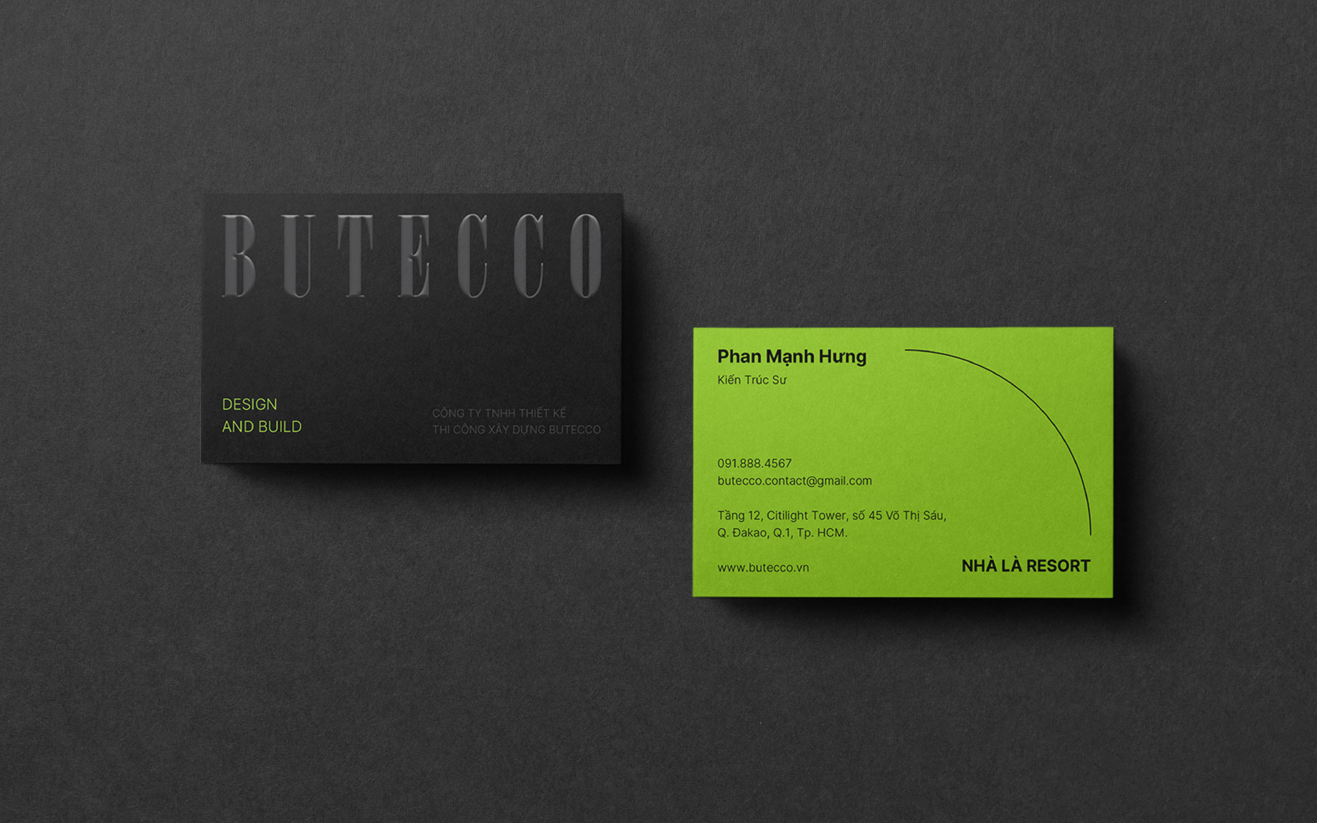
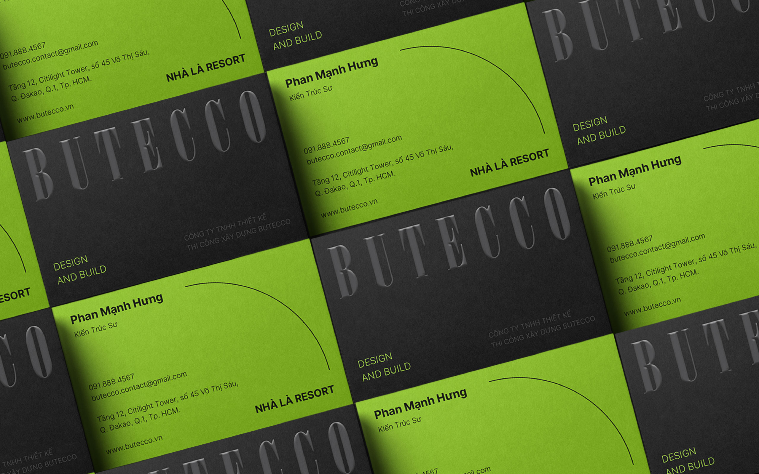
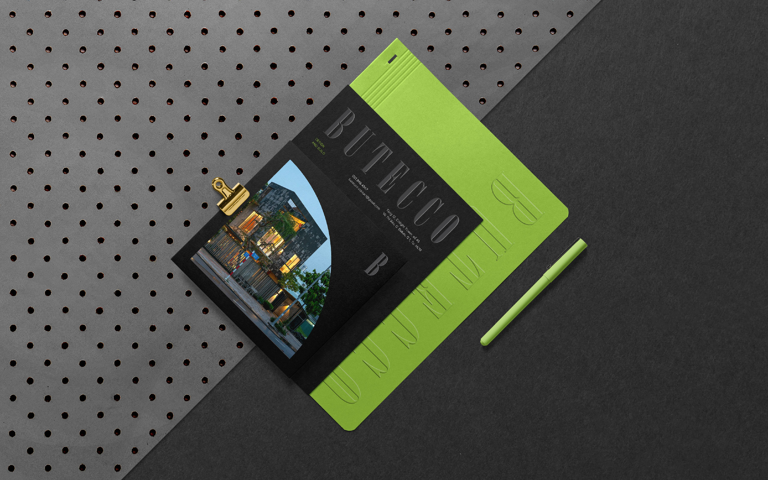
Butecco selected green and black as its primary colors, a combination that is refined yet perfectly aligned with its philosophy of creating green living spaces and pursuing sustainable development.
Green symbolizes life, connection to nature, and sustainability, all values that Butecco integrates into every living space. It also brings feelings of tranquility, harmony, and balance—qualities every home should embody.
In contrast, black represents depth, precision, and class, asserting the stature of an experienced interior design brand with a strong aesthetic sensibility.
The interplay of green and black creates a minimalist yet powerful visual identity, mirroring the way Butecco designs spaces: understated but unforgettable.
A UNIQUE VISUAL LANGUAGE THROUGH CONSISTENCY
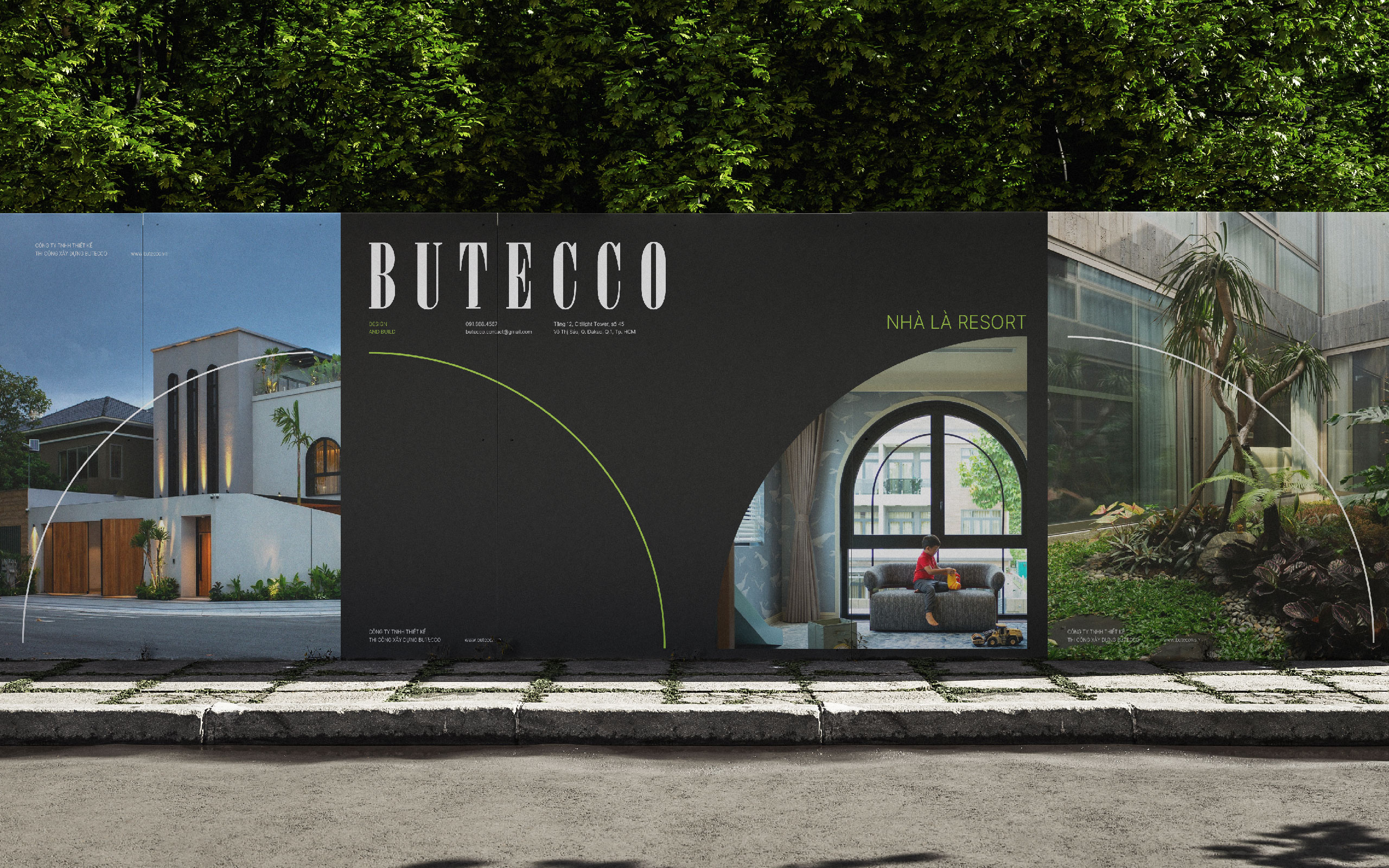
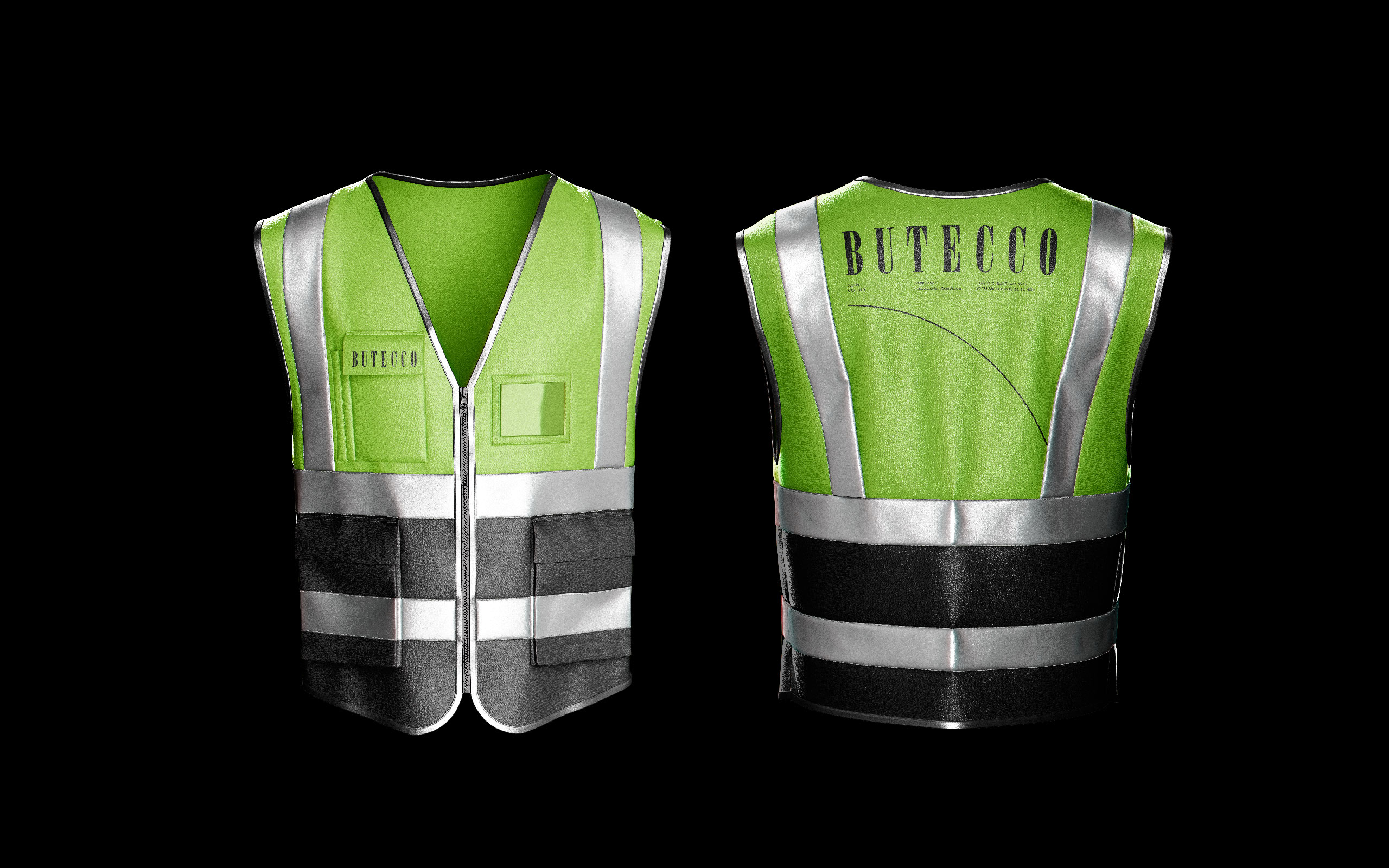
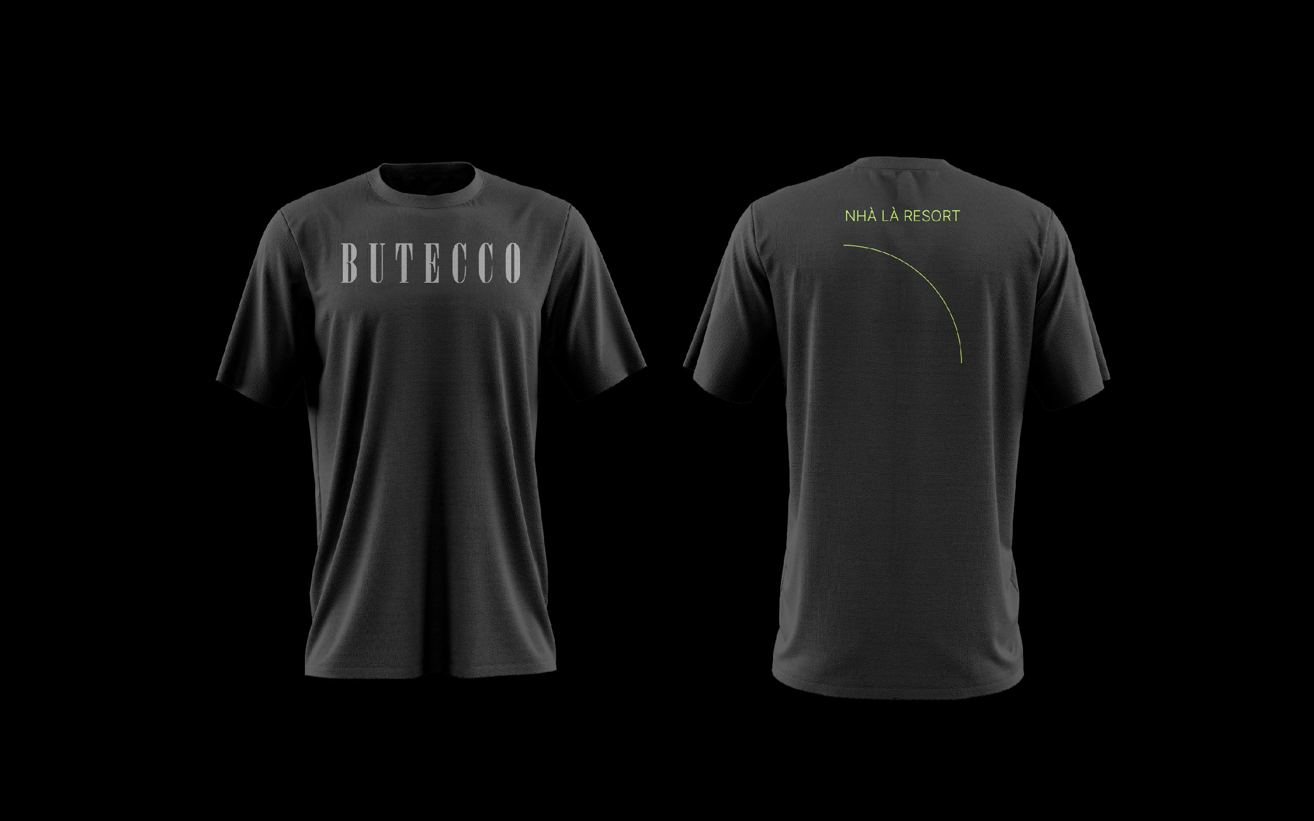
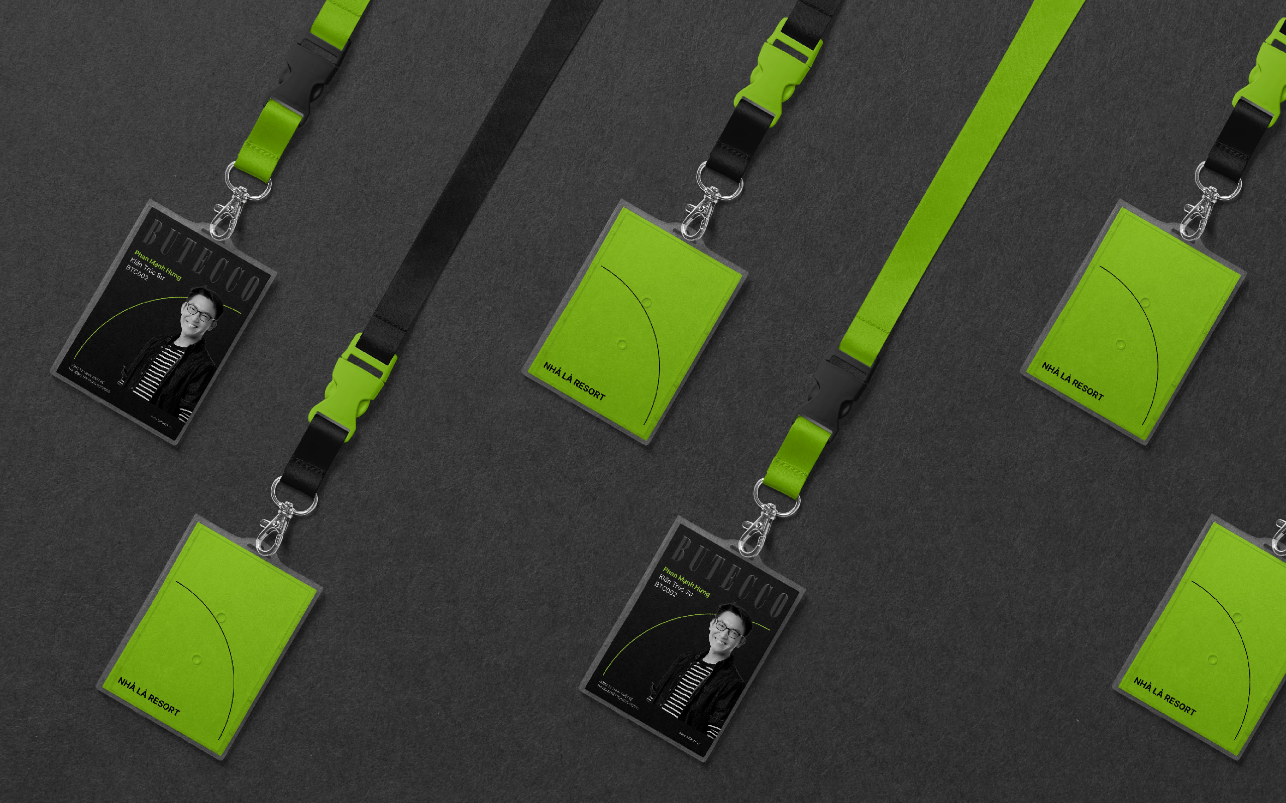
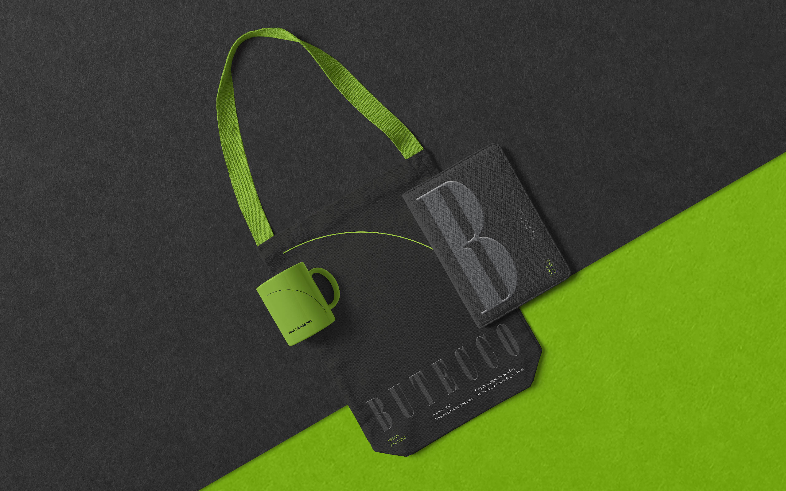
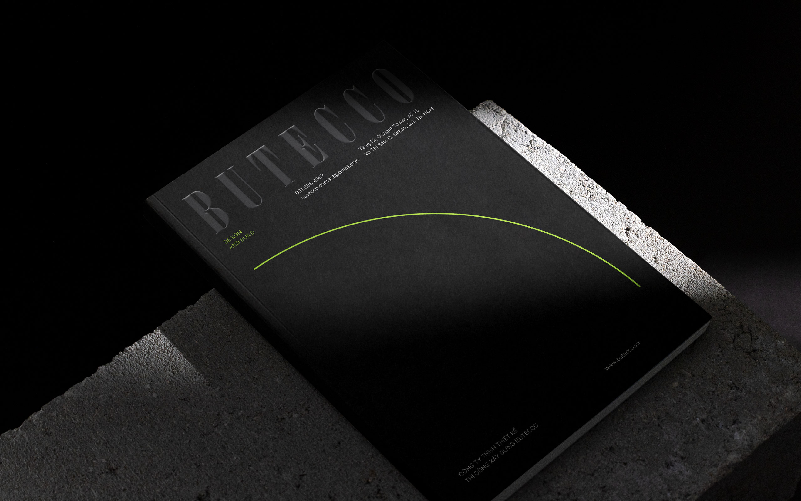
The recurring use of curved forms in Butecco’s brand identity is more than a design choice; it’s a visual language rich with meaning.
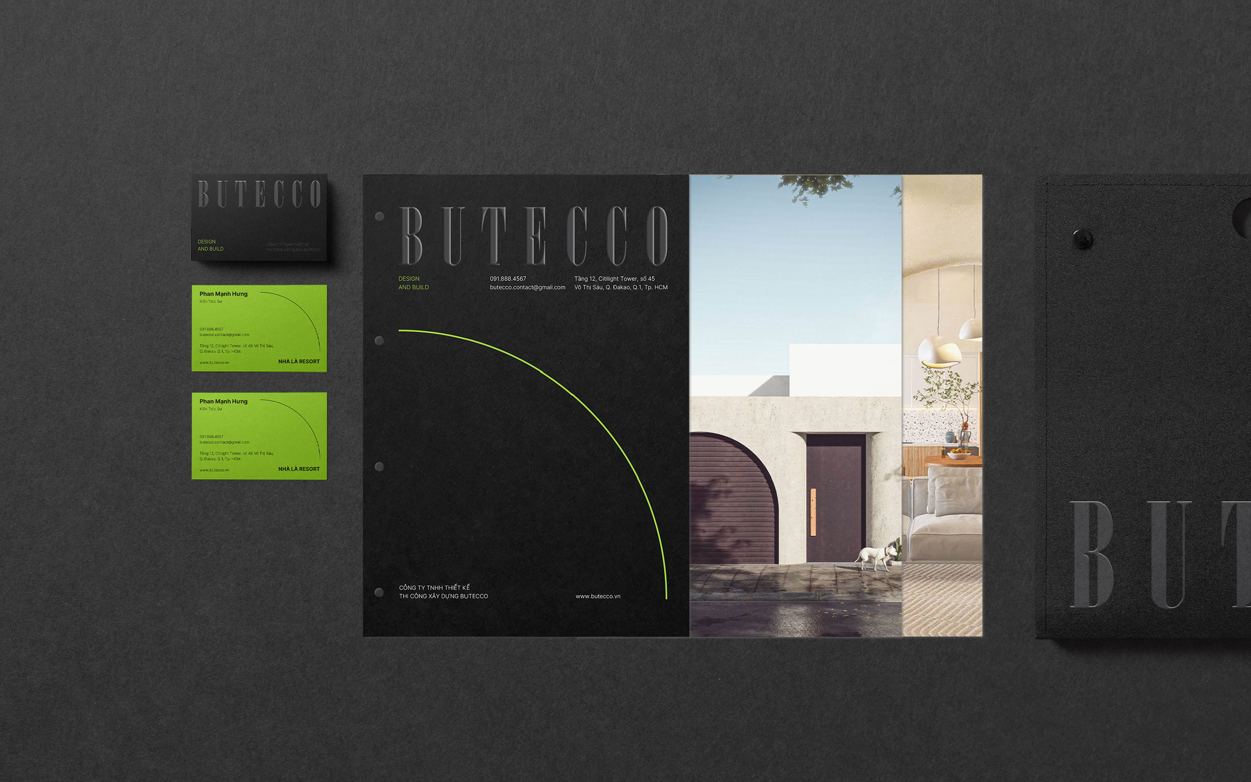
The flowing curves evoke lightness and simplicity while metaphorically expressing Butecco’s design philosophy of “softening living spaces.” They represent the balance between architecture and emotion, between structure and experience.
These curves also symbolize connection and constant motion, Butecco’s adaptability to modern living needs while maintaining elegance and sophistication. Repeated across media, the curve becomes a subtle yet distinctive signature.
In this project, Tree Creative didn’t simply refine the logo, unify colors, and adjust visuals; it reshaped Butecco’s image from its roots: values, design philosophy, and identity application across media, publications, and display spaces. This collaboration showcases Butecco’s openness and progressive mindset, understanding that to stand strong in the future, a brand must constantly evolve.
The brand repositioning marks a strategic step for Butecco, not only to be beautiful in the spaces it creates but also in how it presents itself, interacts, and connects with customers. Partnering with Tree Creative has allowed Butecco to redefine its visual identity, inspire creativity, and prepare for long-term growth.
