
Education
The English Studio
Founded in 2014, The English Studio Danang began with a simple love: a passion for English and a young woman’s aspiration to teach . From the beginning, the founder of TES did not want to create an educational model that only relied on rigid, off-the-shelf course materials. She believed that every learner is unique – with their own starting level, goals, learning pace, and study methods. Therefore, a good curriculum shouldn’t be a packaged product for everyone, but one tailored specifically for the individual student.
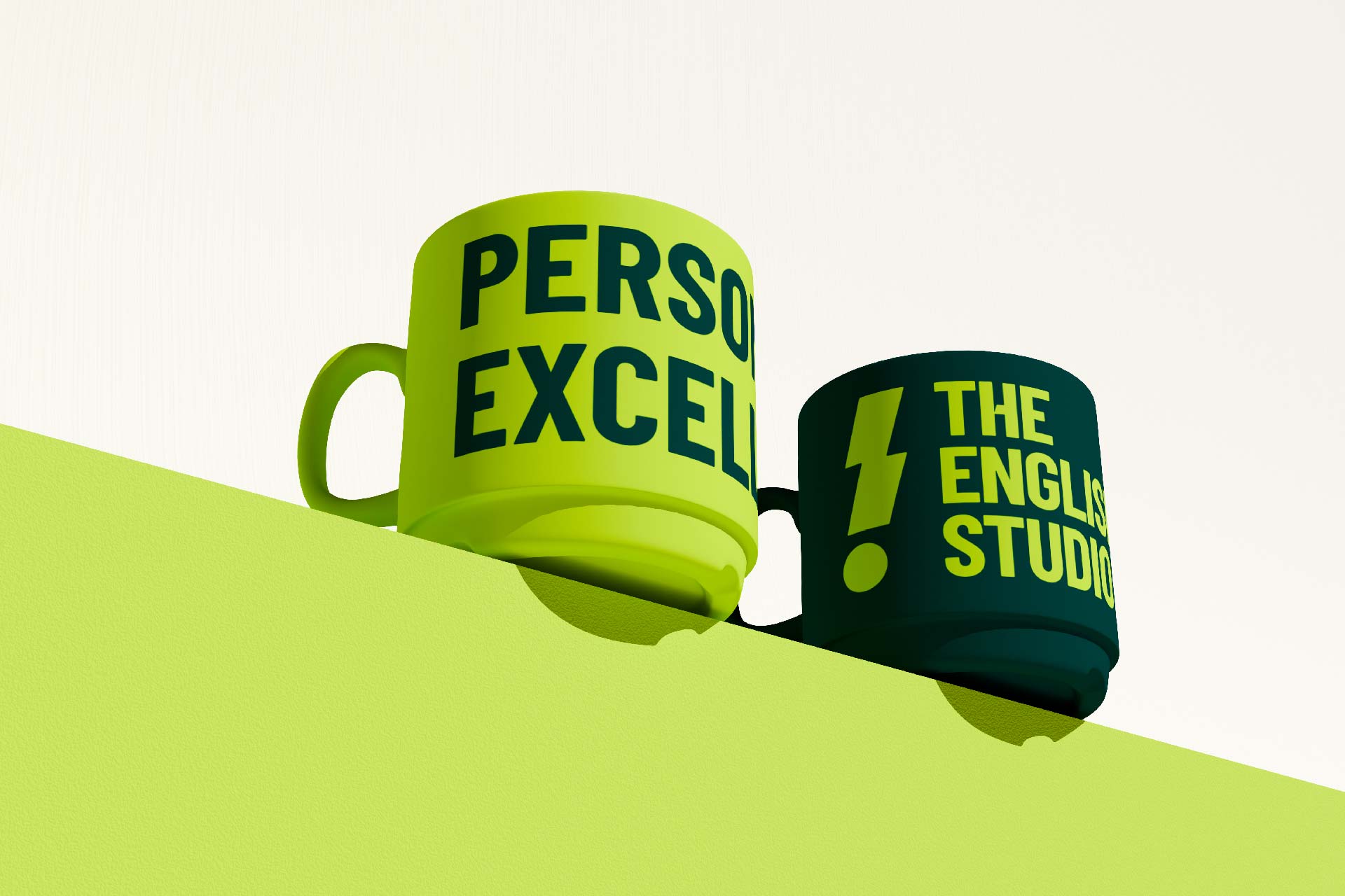
Driven by that belief, The English Studio Danang was born and gradually developed along a distinct path: an English learning space with a studio approach – where experiences are personalized, class sizes are small, and teachers work closely with every student. The “Personalized Excellence” philosophy became TES’s core value throughout its journey, not only to help learners master IELTS or academic English, but also to develop communication, critical thinking, presentation, and other essential skills for studying, working, and living in a global environment.
TES goes beyond just teaching Vietnamese learners. With its specialized “English for Foreigners” programs, TES extends its experience to foreigners who are seeking language skills alongside discovering local culture . The hybrid learning model, which implements technology into education while still putting human connection and motivation at its very center, also plays a part in the brand’s growth strategy.
These core values presented an interesting challenge for Tree Creative: How can an educational brand built on personalization, modern thinking, and high energy create a visual presence that can be seen and felt at first glance?

Refreshing the visual identity to truly reflect a distinct educational model
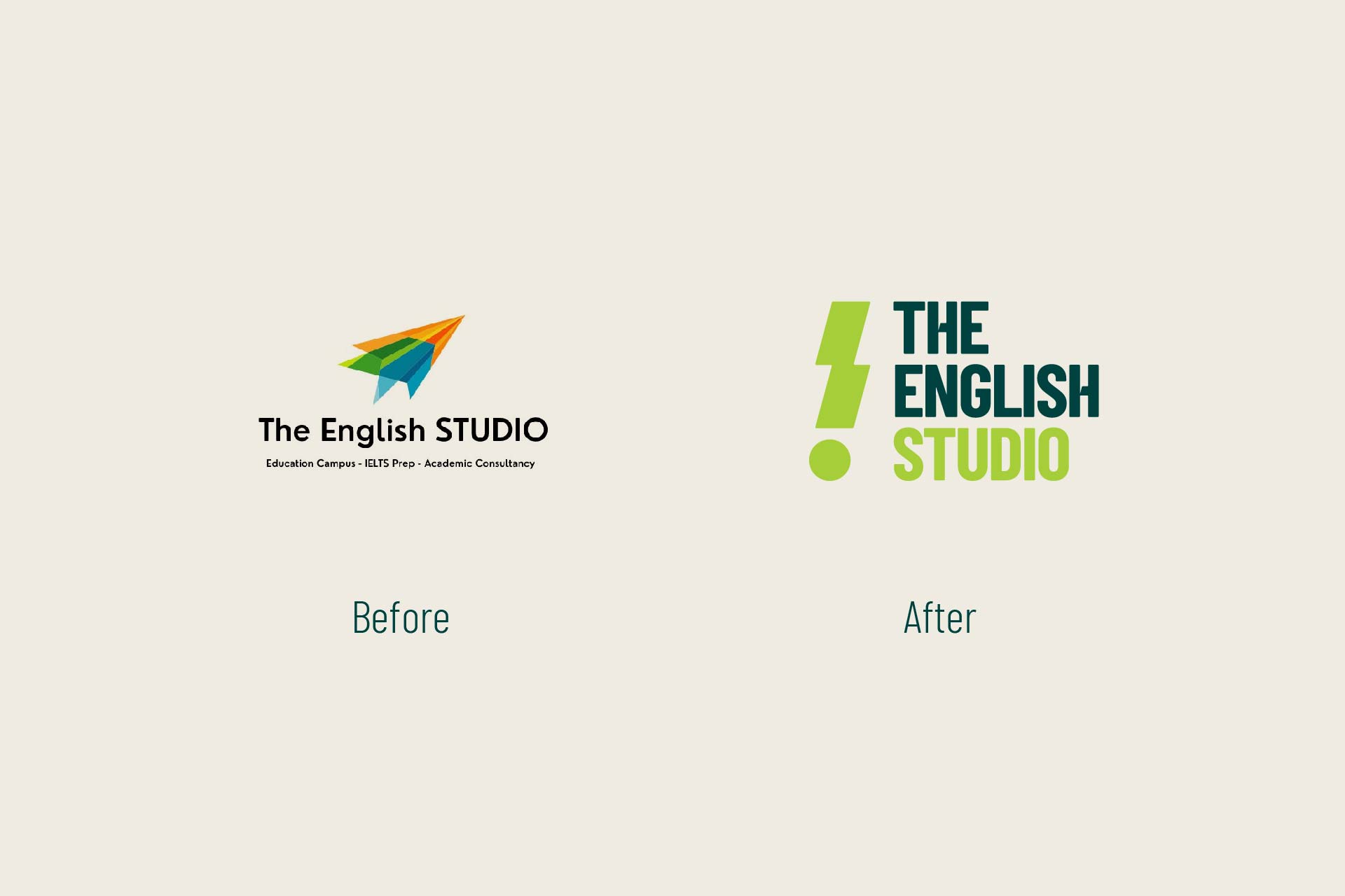
After years of growth, TES turned to Tree Creative hoping to refresh its brand identity into a more professional, modern, and distinct visual language – one that would clearly set it apart from traditional English centers.
For us, this was more than a simple logo redesign. It was a process of finding a visual language that could convey the spirit of “Personalized Excellence” – personalized without being simplistic, professional without being rigid, and educational while remaining youthful, creative, and expressive.

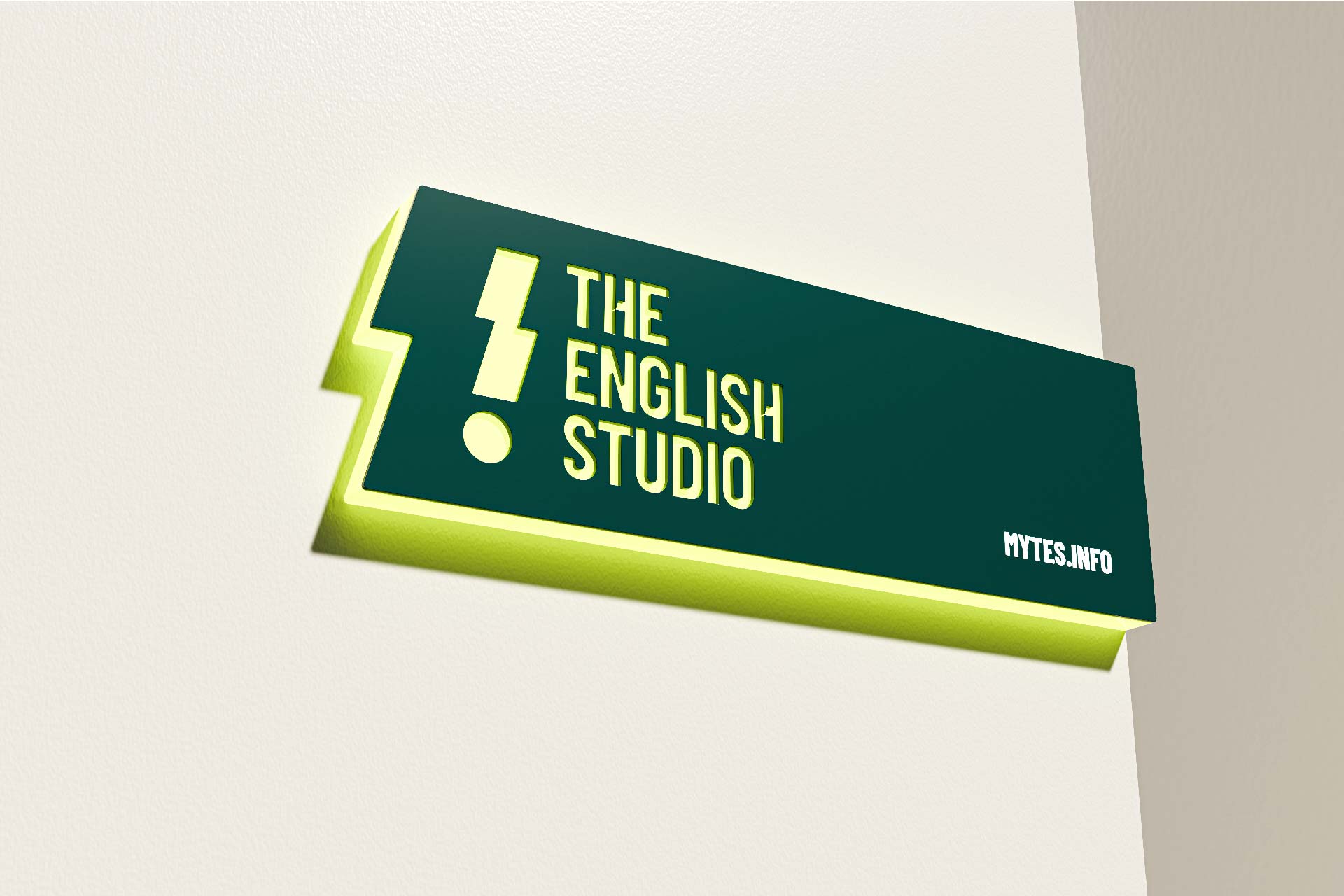
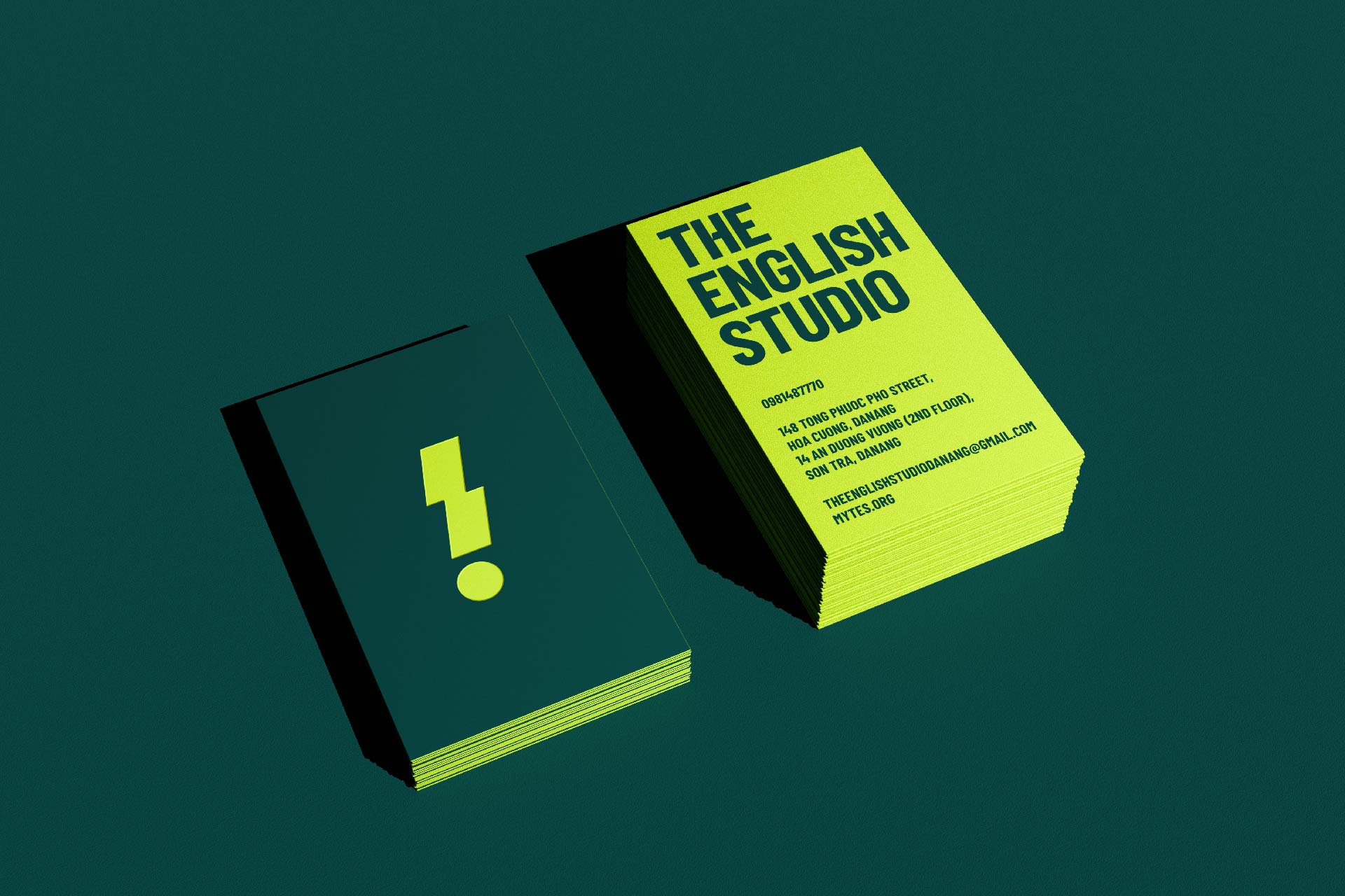
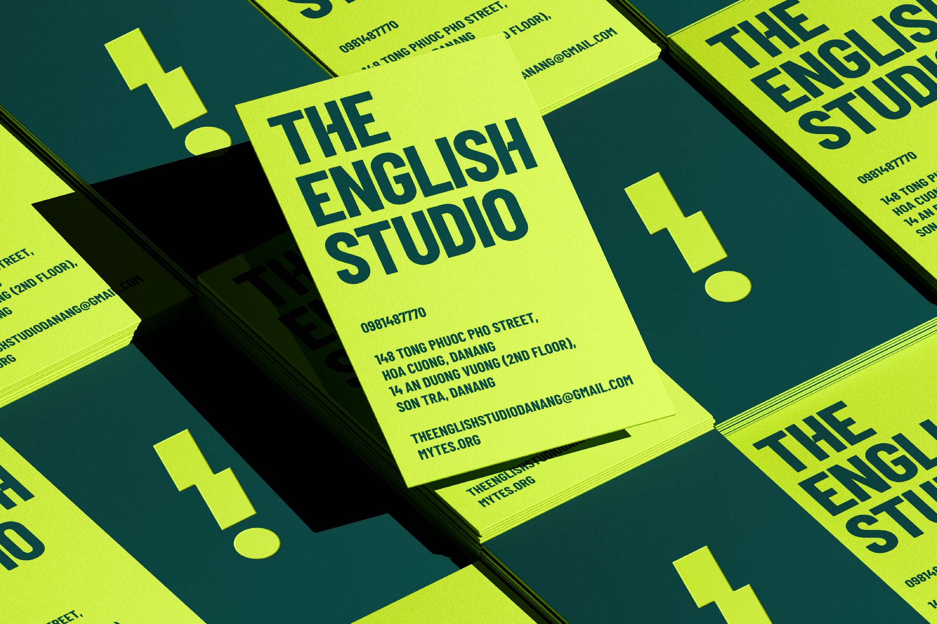
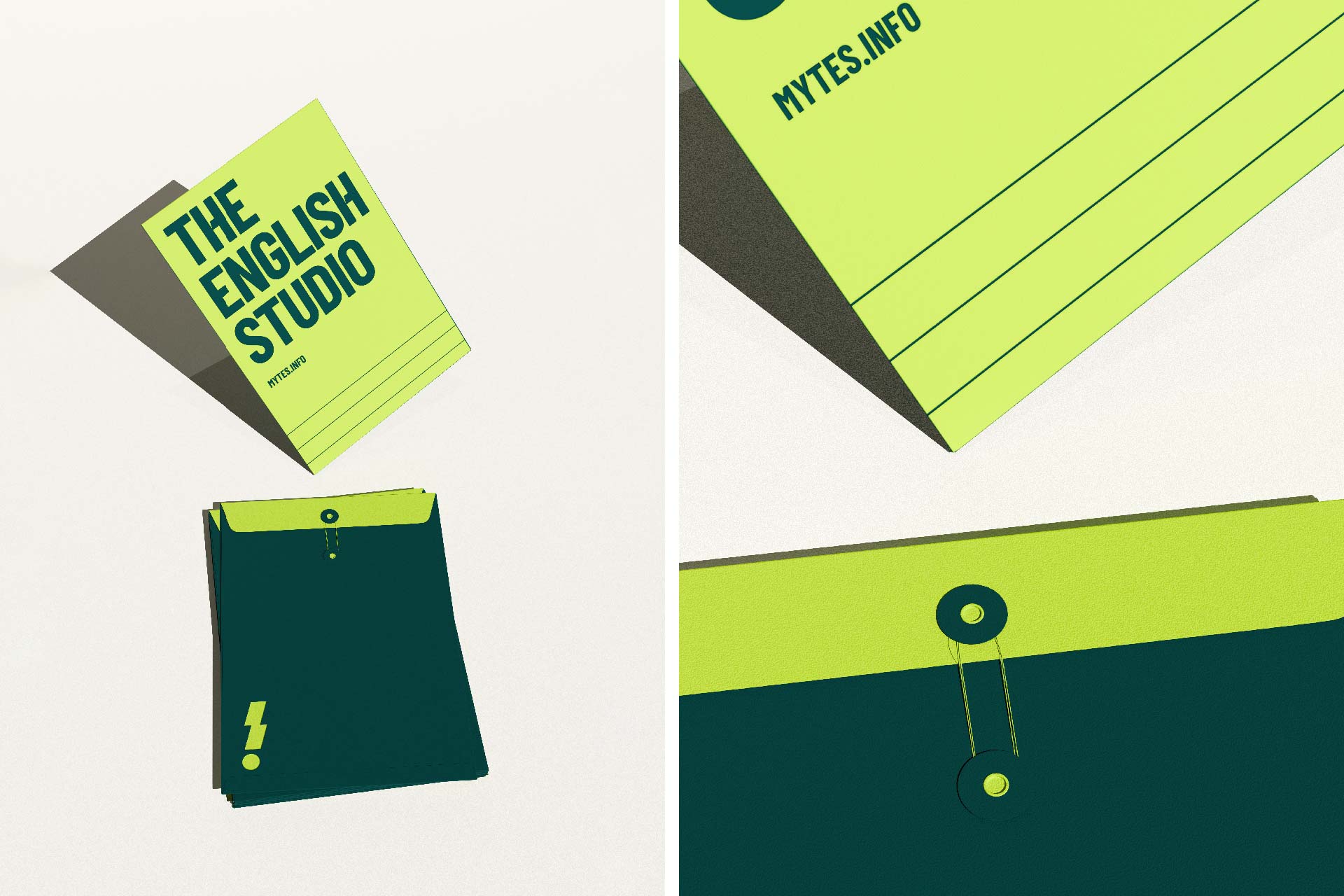

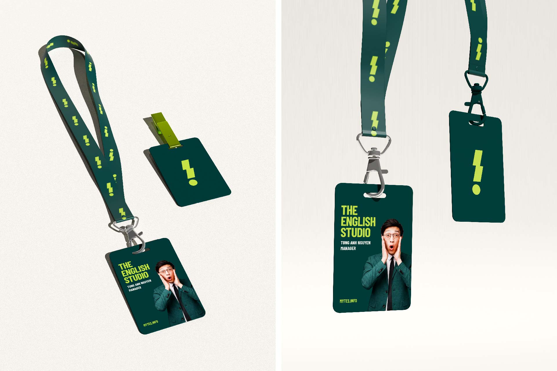
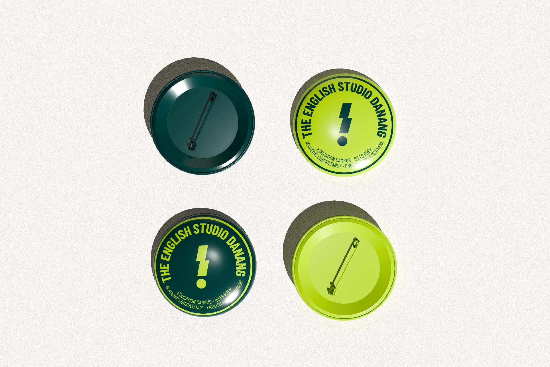

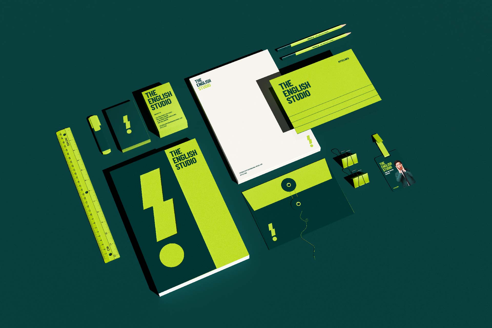
The visual concept was developed by Tree Creative from an exclamation mark combined with a stylized “WOW”—a symbol representing the feeling of surprise, engagement, and the moment when a student grasps a new idea. This reflects the exact feeling TES aims to create through every learning experience: a “WOW!” moment when students make progress, discover their potential, and break past new boundaries.

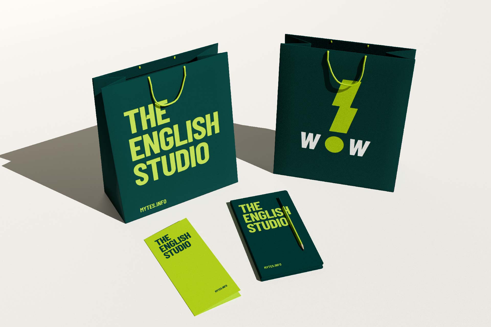
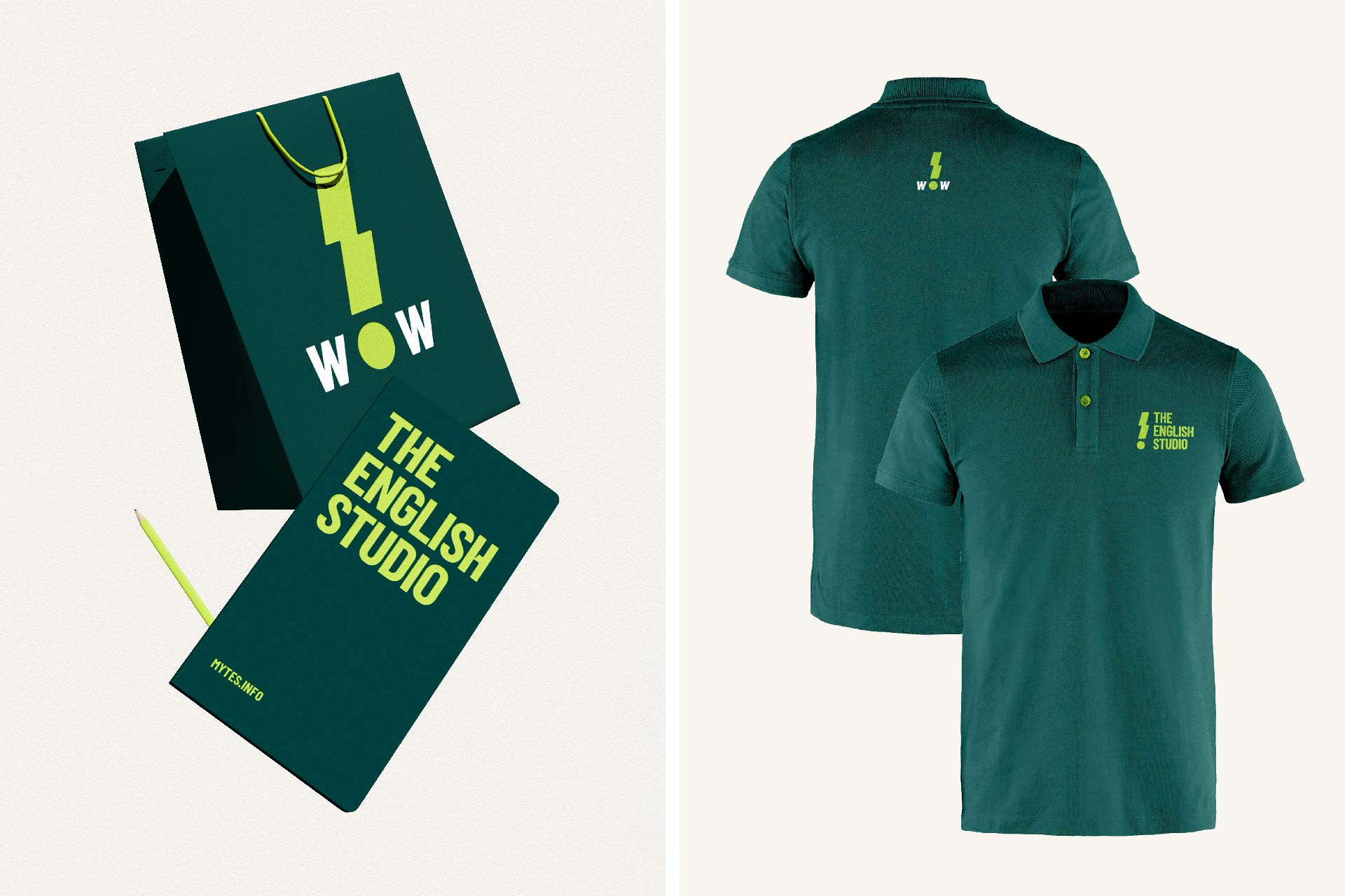
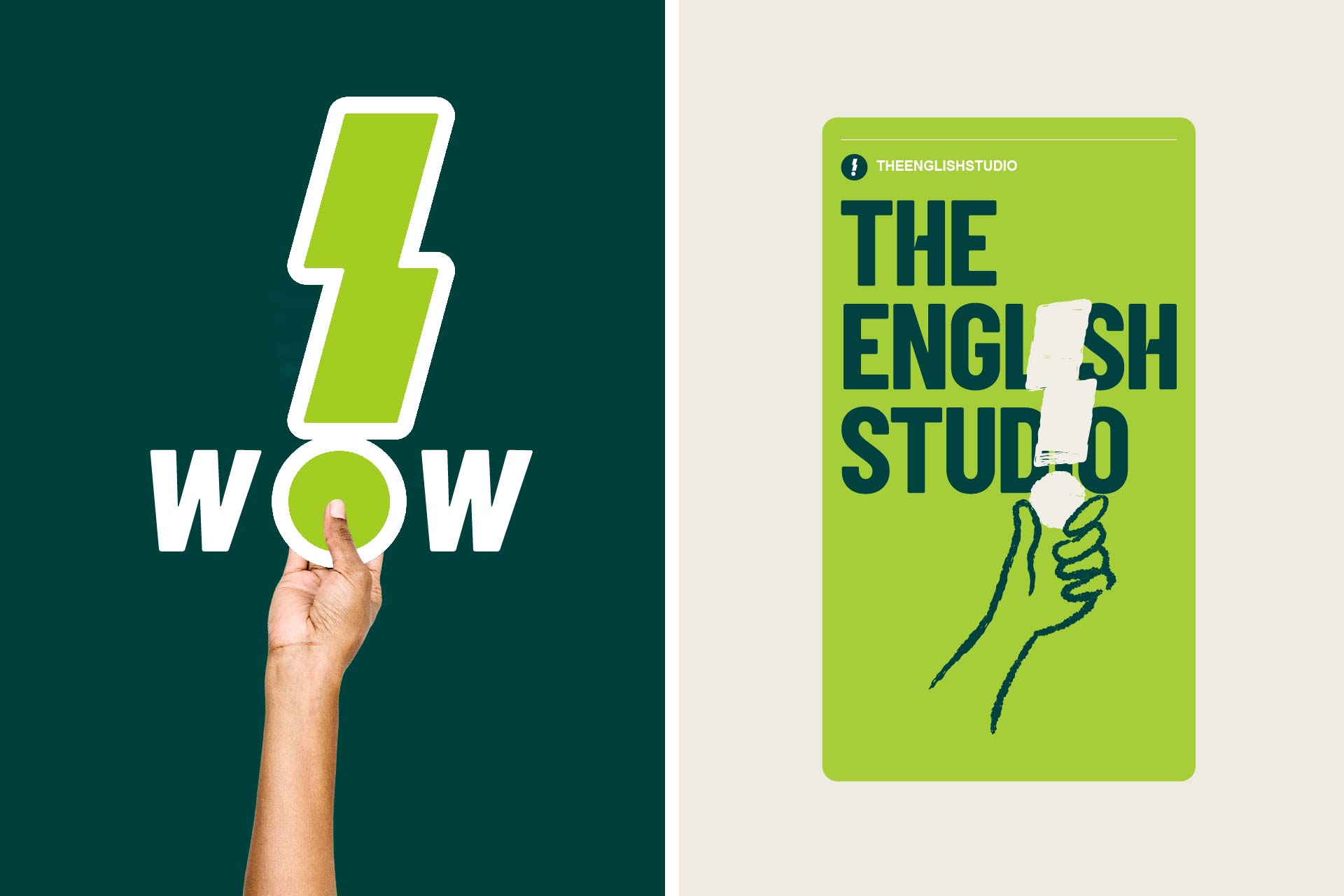
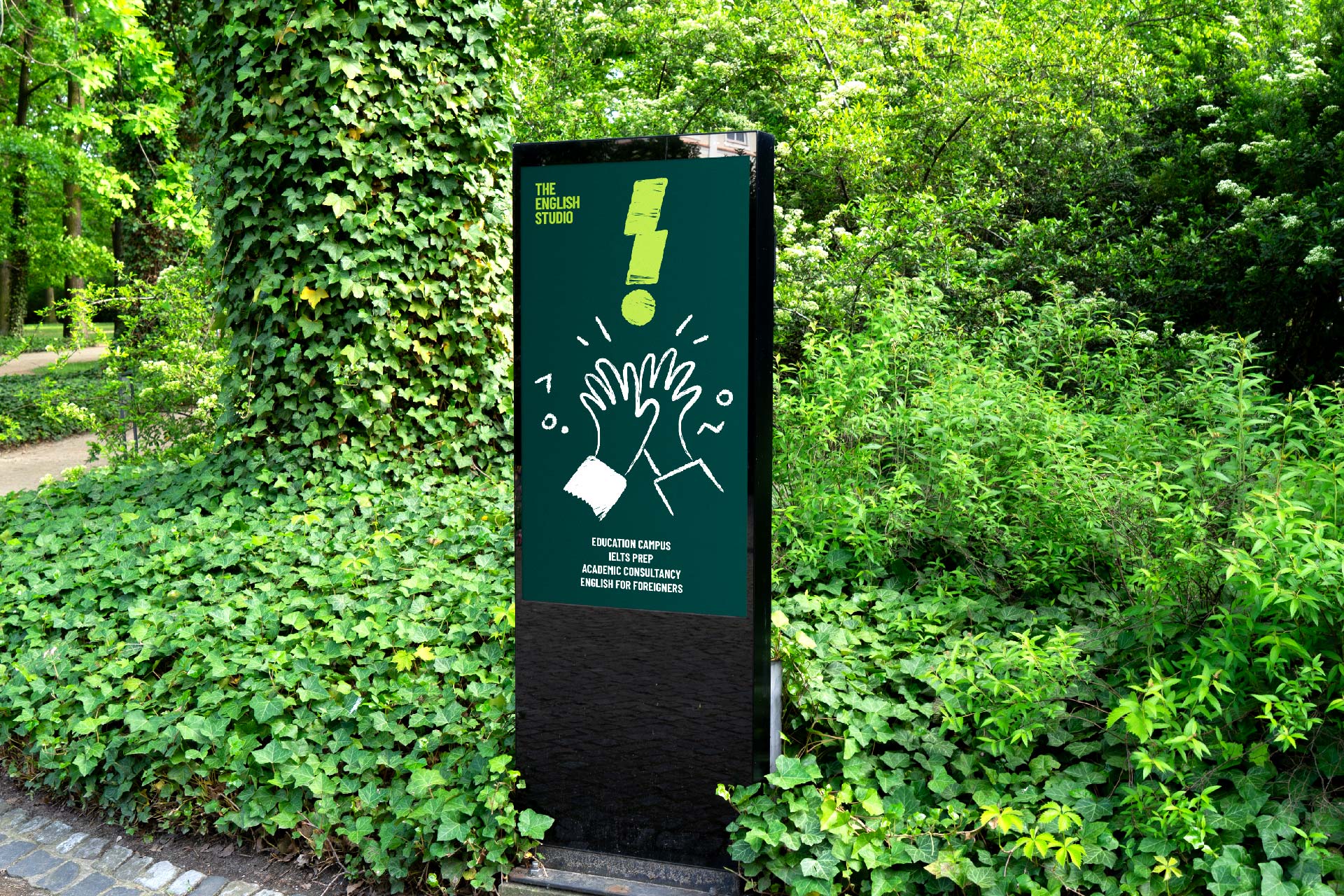
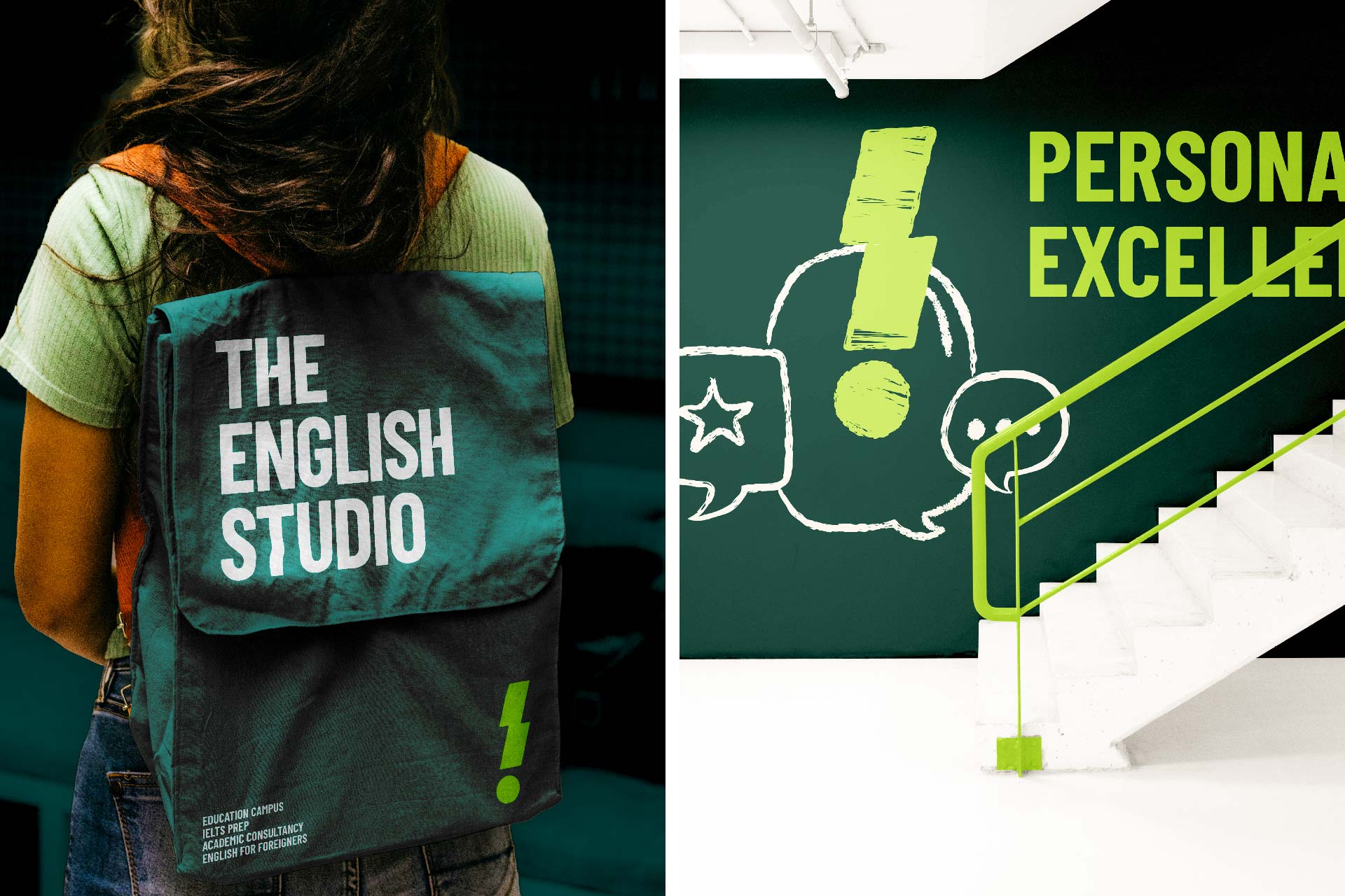
To bring this spirit to life in a more approachable way, Tree Creative developed a visual system built on pencil-drawn illustrations. The natural, tactile pencil strokes give a nod to note-taking, sketching, and the creative ideas born through learning.

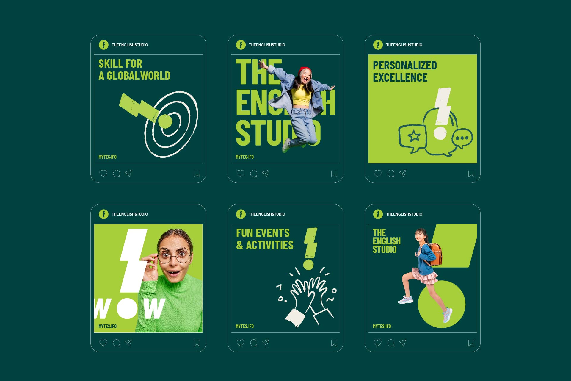

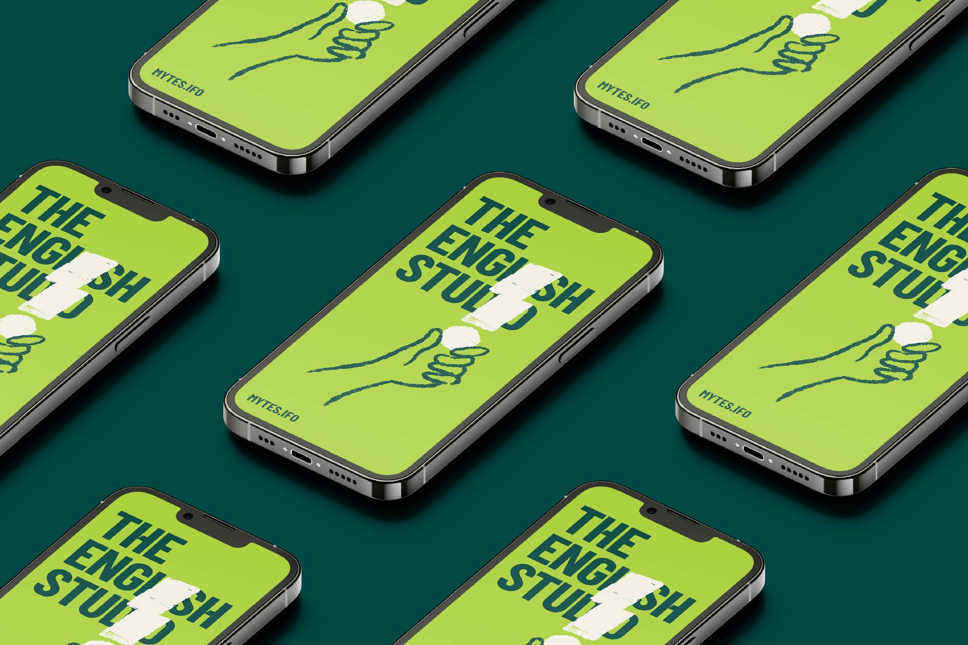

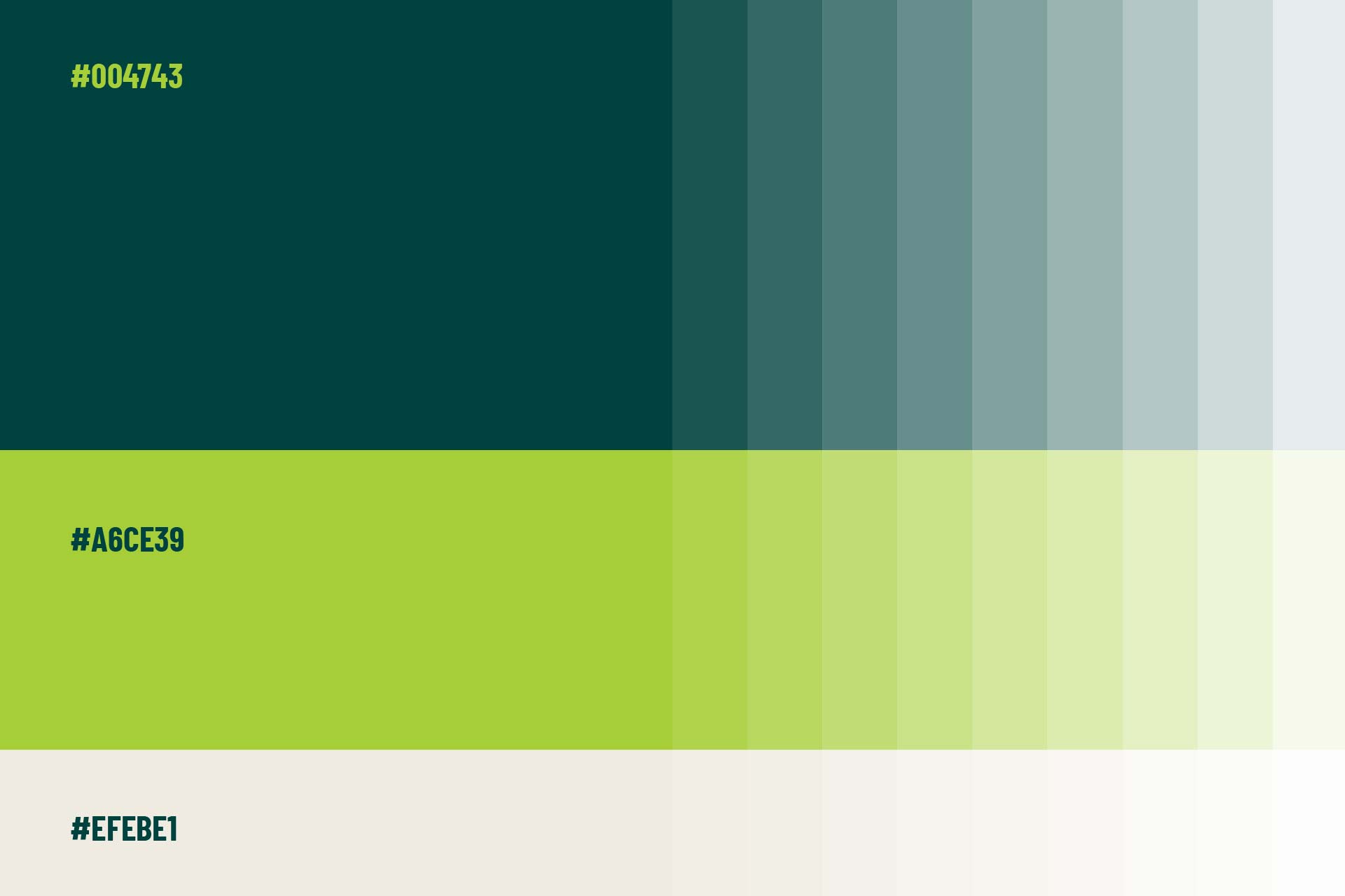
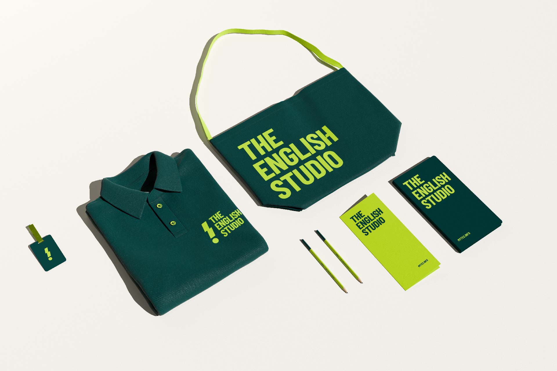
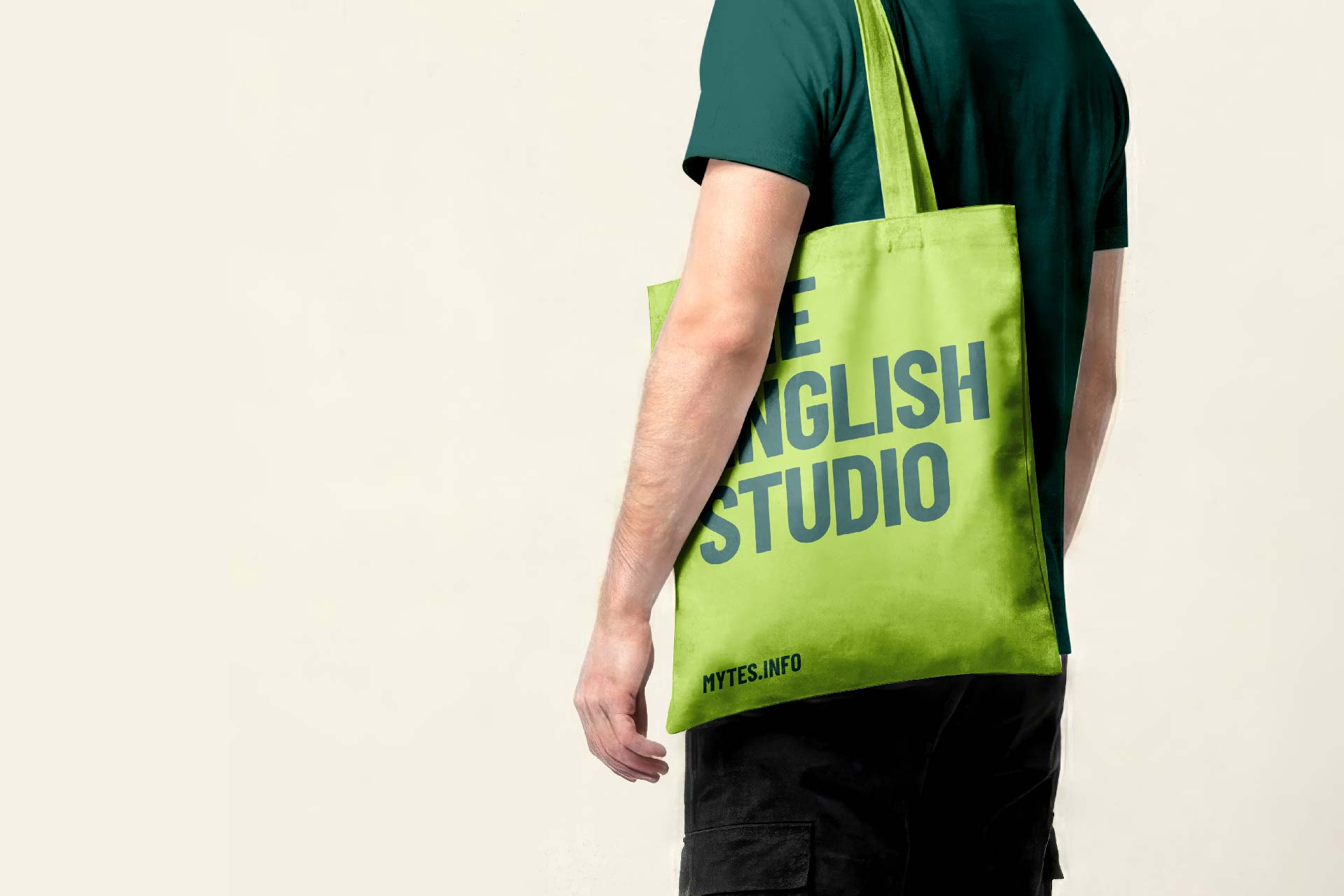
The color palette, typography, patterns, and illustrations work together to capture TES’s energetic, modern, and youthful character while providing flexibility across every touchpoint.
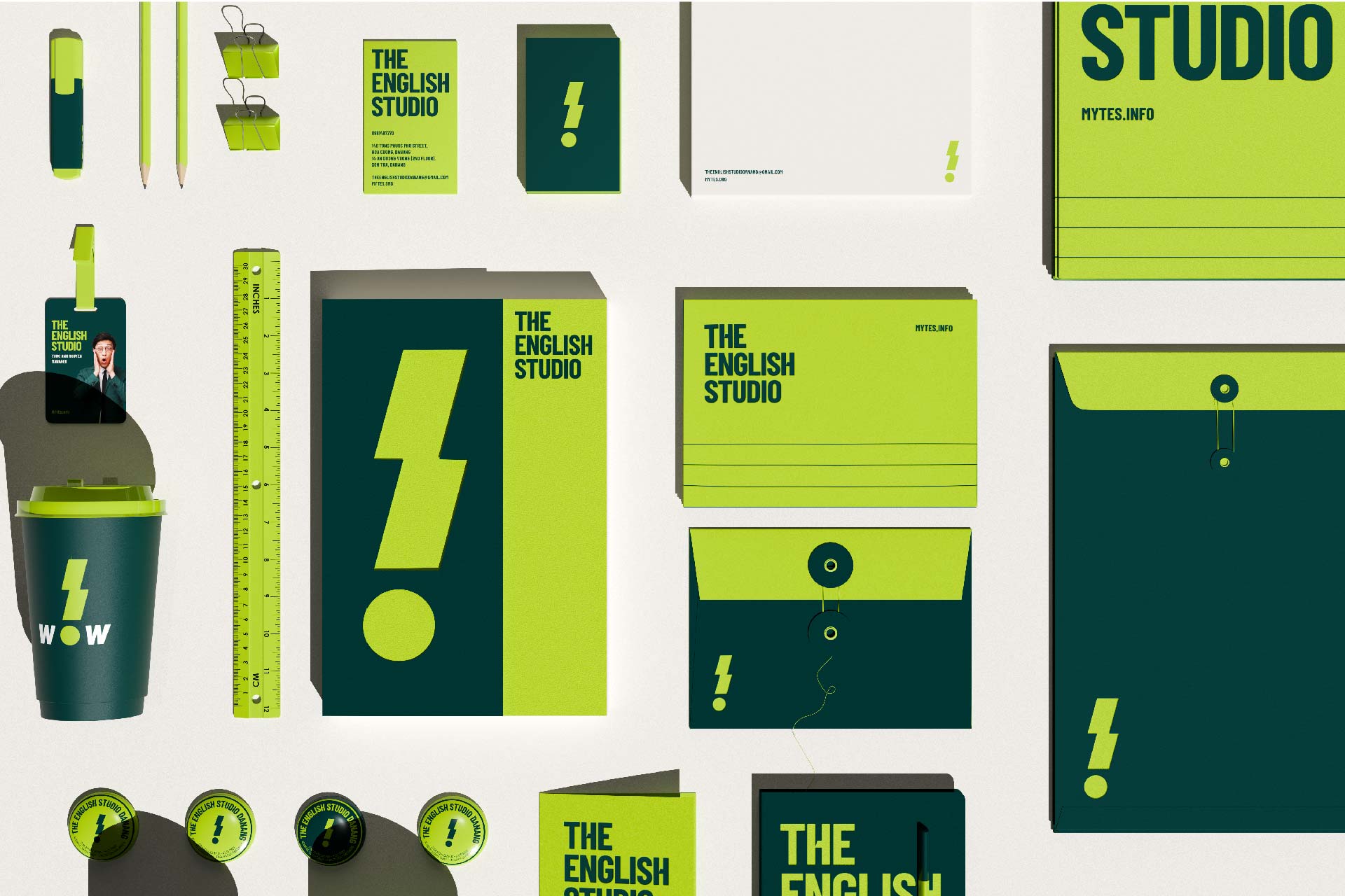
From the logo and visual identity, the new branding was implemented across marketing collateral, curriculum materials, and branded touchpoints – helping make TES look more consistent, professional, and memorable.

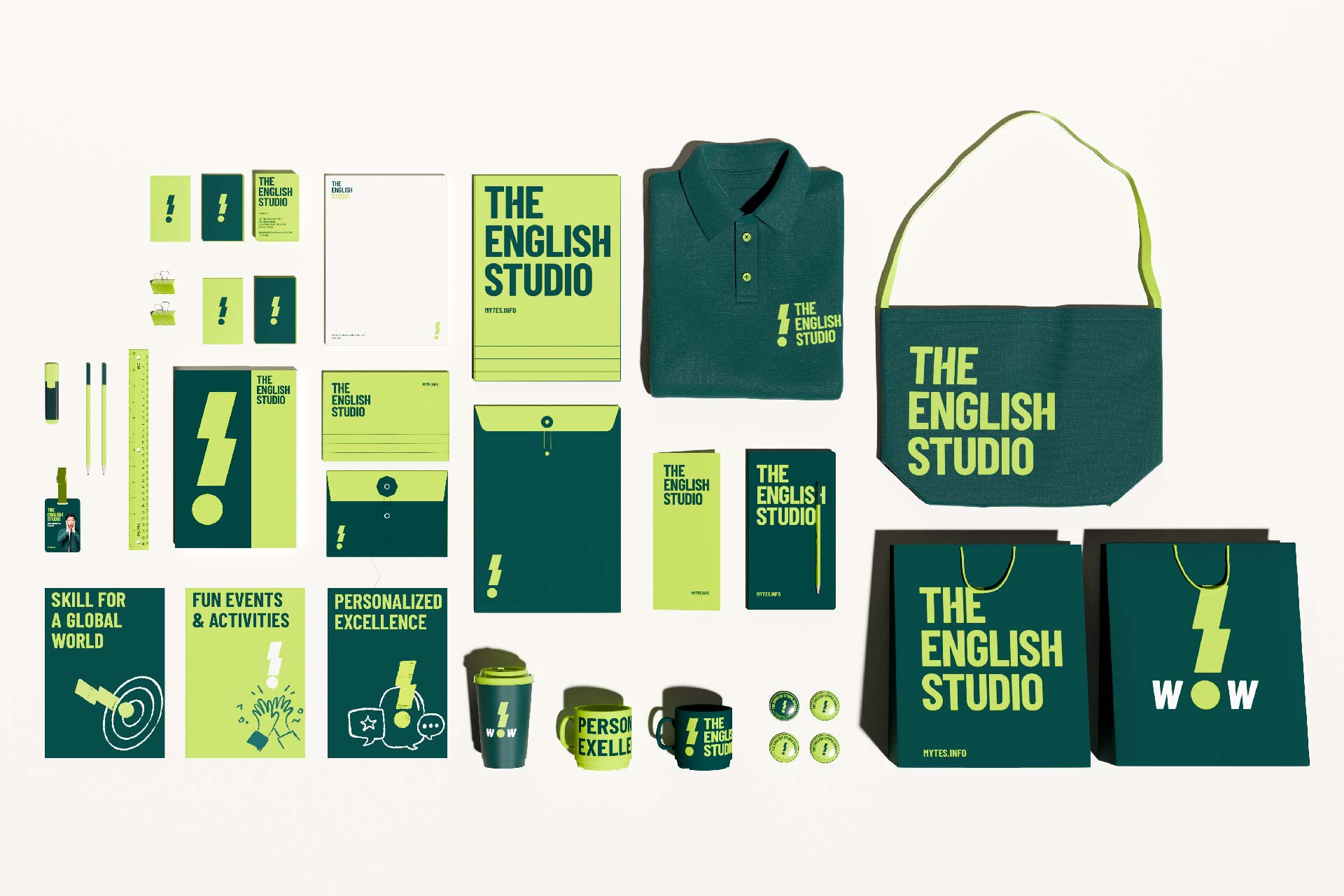
For Tree Creative, the project’s true value lies not just in delivering a fresh look for TES, but also in making the spirit of “Personalized Excellence” more visible and felt across every brand touchpoint.